
Jump to
1. Introduction
There has been much debate in Australia about whether income inequality is increasing. This study uses the various unit record files of national sample surveys undertaken by the Australian Bureau of Statistics (ABS) to look at this issue. Section 2 briefly summarises the methodology of this study. Much greater detail is provided in appendix A. Section 3 looks at trends in income inequality, first analysing results from the ABS Household Expenditure Surveys and then contrasting these with outcomes from the ABS income surveys (initially named the Income Distribution Survey but replaced in 1994-95 by the Survey of Income and Housing Costs). Arguably, spending is a better measure of economic resources than income and so section 4 examines trends in expenditure inequality in Australia. One of the key findings of this study is that, while income inequality has been increasing, current expenditure inequality appears to have remained stable. Consequently, section 5 explores the relationship between the income and expenditure patterns of Australian households, ranked by their income. This suggests that there was a marked change in the composition of the poorest 10 per cent of households in the past decade. Section 6 summarises the paper.
It must be emphasised that it has recently become apparent that these results can be regarded as only preliminary. The results in this paper rely on the publicly available microdata files released by the ABS. The ABS recently revealed that it has concerns about the accuracy of the income data, particularly at the bottom end of the income distribution (ABS (Australian Bureau of Statistics), 2002). It apparently intends to release revised versions of the unit record files of both the income and expenditure surveys, although the timeline for this is uncertain.
2. Data and methodology
The data and methodology used in this analysis are described in full in appendix A; this section provides only a summary. For reasons explained in the appendix:
the data sources are the unit record tapes released by the ABS for the Household Expenditure Surveys and the income surveys;
the income unit used is the household;
the equivalence scale used is the square root of household size — the so-called ‘international’ scale because it is widely used internationally;
income is current weekly income;
negative business and investment incomes in the later surveys were reset to zero to maintain comparability with the earlier surveys;
the measure of resources is either disposable (after-income tax) income or expenditure, both adjusted by the equivalence scale to take into account the needs of households of different size and by the consumer price index (CPI) to bring all measures to March 2001 dollars; and
the income distribution is determined by a ranking of people by their equivalent household income, so that a household containing five people is counted five times, not once, when calculating inequality.
Because of concerns with either data quality or data comparability, we did not use the 1975-76 Household Expenditure Survey (HES), the 1982 current income data in the Income Distribution Survey (IDS), the 1985-86 IDS and the 1996-97 Survey of Income and Housing Costs (SIHC). We also recommend treating results using disposable income data from the 1984 HES with caution because the method of imputing income tax was less sophisticated than that for later years.
3. Income inequality
3.1 Results from the expenditure surveys
One widely used summary measure of inequality is the Gini coefficient, which varies between 0, when income is equally distributed, and 1, when one household holds all income. As is explained in appendix A, Gini coefficients are derived from ‘Lorenz curves’. In general, a higher Gini coefficient is associated with increasing inequality, although this is not necessarily the case where the Lorenz curves for two years cross (Atkinson, 1970). The periods where the Lorenz curves cross are noted in the text.
Estimated Gini coefficients are shown in Figure 1, which demonstrates the impact of resetting negative incomes. Taking first the case where negative incomes have been set to zero, Figure 1 suggests that equivalent disposable income inequality increased between 1988-89 and 1998-99. This is shown by the increase in the Gini coefficient from 0.295 to 0.311. The Lorenz curves for these two years do not cross and so, according to the HES data, income inequality clearly increased over the period. However, the curves do cross for the later period (1993-94 to 1998-99), so no clear conclusion can be drawn about changes in inequality in the second half of the 1990s.
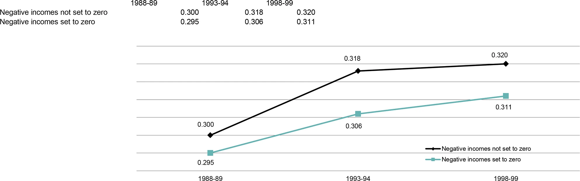
Figure 1 also shows that the overall trends are generally consistent when all negative incomes are not set to zero in the three later years of the Household Expenditure Surveys. One change is that the movement in the Gini coefficients between 1993-94 and 1998-99 is not statistically significant, again throwing uncertainty on how the income distribution changed over this period. In other words, the original data (when negative incomes were not set to zero) suggests that most of the increase in inequality occurred during the early 1990s, with lower unemployment perhaps helping to reduce the pace of inequality increases in the late 1990s (Table 1). It is also noteworthy that the gap between the ‘set to zero’ and ‘not set to zero’ Gini coefficients was greater in the 1990s than at the end of the 1980s, suggesting the possible increasing impact of negative incomes on the income distribution. (This may be due to, for example, the growing importance of negatively gearing property.) The impact of setting negative incomes to zero on inequality measurement is discussed further in appendix A.
| 1984* | 1988-89 | 1993-94 | 1998-99 | Change 1988-89 to 1998-99 | |
|---|---|---|---|---|---|
| Income at points in the distribution | $ | $ | $ | $ | % |
| 95th percentile | 1 788 | 1 770 | 1 886 | 2 103 | 18.8 |
| 90th percentile | 1 511 | 1 533 | 1 593 | 1 775 | 15.8 |
| 75th percentile | 1 125 | 1 155 | 1 191 | 1 318 | 14.1 |
| Mean | 884 | 908 | 921 | 1 011 | 11.4 |
| Median | 771 | 804 | 801 | 890 | 10.7 |
| 25th percentile | 517 | 542 | 533 | 586 | 8.1 |
| 10th percentile | 382 | 393 | 406 | 410 | 4.2 |
| 5th percentile | 339 | 343 | 335 | 327 | -4.6 |
| Percentile income ratios | |||||
| 95:10 (very top:bottom) | 4.63 | 4.50 | 4.64 | 5.13 | 14.1 |
| 90:10 (top:bottom) | 4.01 | 3.90 | 3.92 | 4.33 | 11.2 |
| 90:50 (top:middle) | 1.99 | 1.91 | 1.99 | 2.00 | 4.6 |
| 50:10 (middle:bottom) | 2.02 | 2.04 | 1.97 | 2.17 | 6.2 |
| Decile shares of income | % | % | % | % | |
| Bottom 10% | 3.4 | 3.2 | 3.1 | 2.7 | -14.7 |
| Middle 20% | 17.6 | 17.8 | 17.4 | 17.6 | -1.2 |
| Top 10% | 22.4 | 22.2 | 22.6 | 22.5 | 1.3 |
| Unemployment rate | 9.0 | 6.4 | 10.2 | 7.4 | 15.6 |
Note: The income measure is the international equivalent weekly disposable household income of individuals. All incomes have been adjusted for inflation to March 2001 dollars. The 95:10 ratio is the ratio of the income of the 95th percentile of the income distribution to the income of the 10th percentile of the income distribution.
Source: ABS Household Expenditure Survey unit record files.
The 1984 figures are not fully comparable and should be interpreted with caution because the method for imputing income tax differs in that year. See appendix A for details.
As already mentioned, when the Lorenz curves cross, it is not possible to determine from the Gini coefficient whether there has been a change in income inequality. Consequently, a variety of other measures are presented in Table 1, which shows real (inflation-adjusted) incomes at different points in the income distribution. Figure 2 suggests that the equivalent disposable household income of the person in the 10th percentile of the income distribution remained fairly stable in real terms from 1988-89 to 1998-99. Incomes in the lower middle and middle of the income distribution increased between the 1993-94 and 1998-99 surveys, after little change over the previous five years. But perhaps the most significant movement was at the top end of the distribution, with average real incomes of those in the 90th and 95th percentiles increasing strongly during the 1990s, particularly in the last half of the decade.
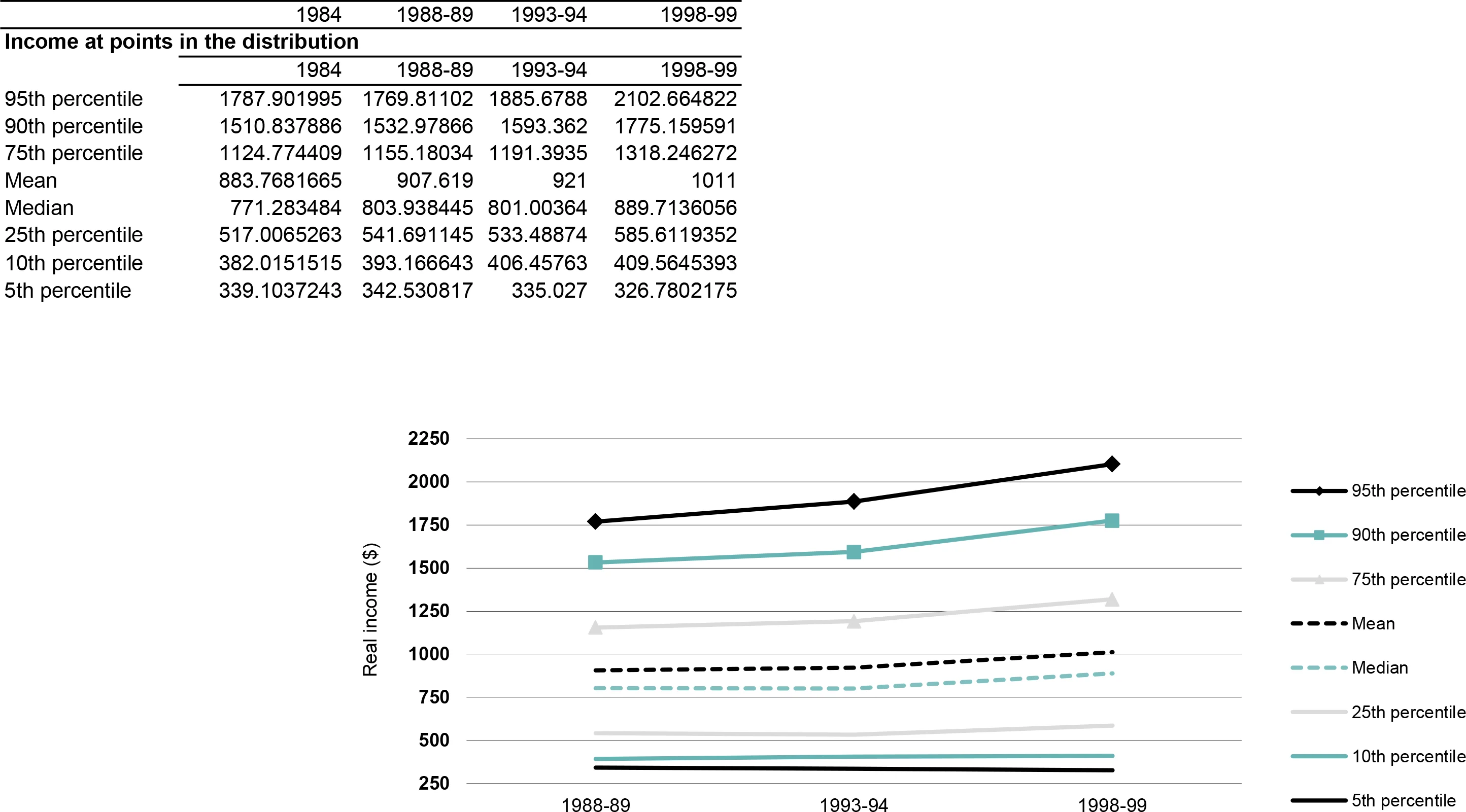
This suggests that there was growth in the income gap between the top and the middle and between the top and the bottom. This is confirmed by the ratios between these various income points (Table 1). Both the 90:10 and the 95:10 ratios increased markedly over the 10 years to 1998-99. The gap between the top and the middle also grew over this period but not by as much, as shown by the lesser increase in the 90:50 ratio. The distance between the middle and the bottom declined a little in the first five years under study, but grew markedly in the last five years, with the median income reaching 2.2 times that of the 10th percentile.
Although later in this paper some concerns are raised about the validity of the 1993-94 data, if the 1993-94 and 1998-99 data are fully comparable they suggest that over that period there was:
a very marked increase in the incomes of those at the top end;
a marked increase in the incomes of those in the middle; and
little change in the real incomes of those in the 10th percentile of the income distribution, but a decline in the real incomes of those in the 5th percentile of the income distribution.
Even after taking out the impact of inflation, on average all households in 1998-99 enjoyed higher incomes than in 1988-89, according to the ABS Household Expenditure Surveys. But the equivalent disposable incomes of the top one-fifth of households increased by almost 14 per cent between 1988-89 and 1998-99, while the incomes of bottom one-fifth of households grew by only 1.5 per cent. The incomes of the middle one-fifth of households grew by 10.2 per cent. So middle Australia lagged behind the top end but did better than the bottom.
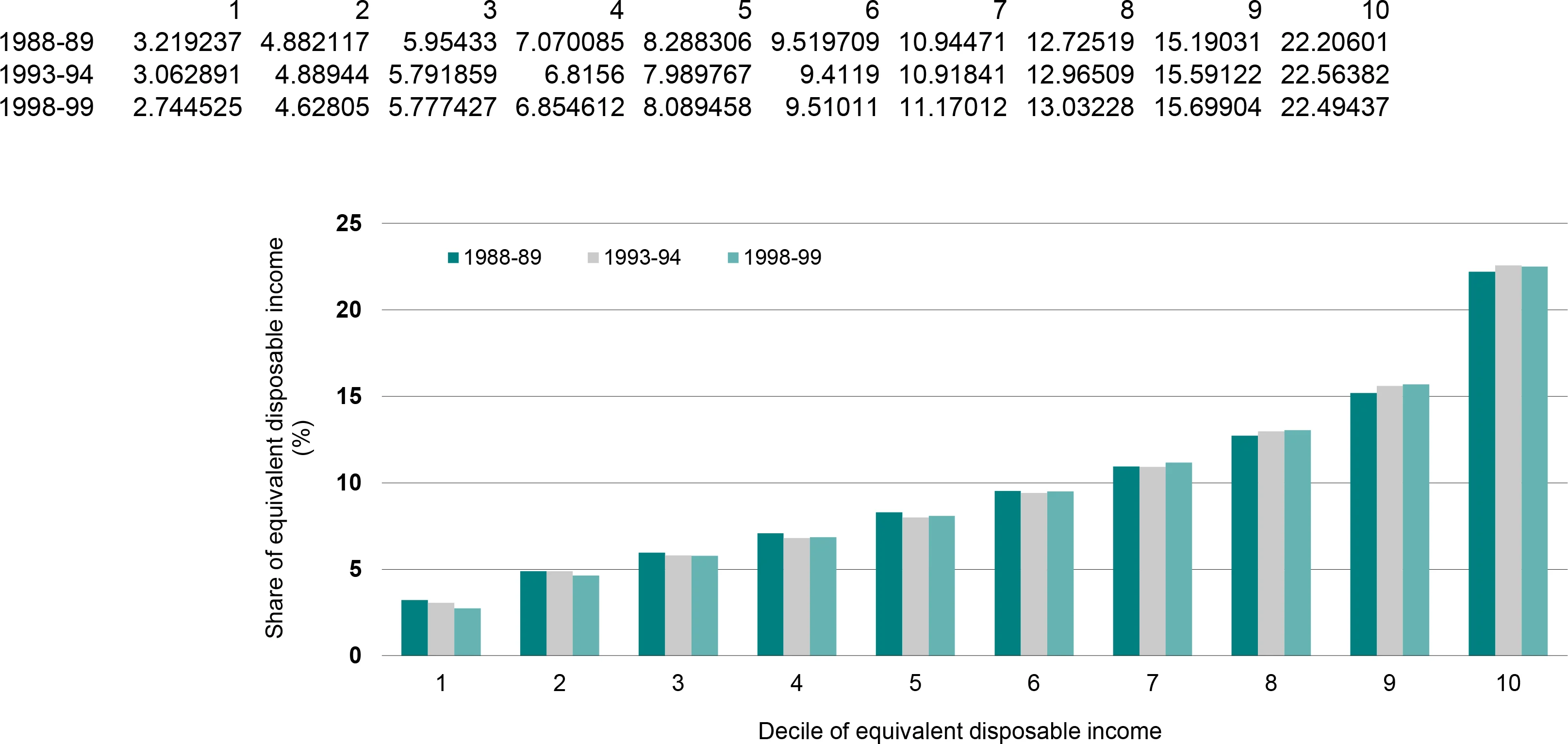
Figure 3 presents the data in another way —the income share of each decile (10 per cent grouping) of Australians. The 1984 results have been left out of this graph, as decile share results appear to be particularly sensitive to the method used to impute income tax, and firm conclusions about this year await the release of more accurate imputed tax data by the ABS (see appendix A for further detail on this issue). The results suggest that the share of the after-tax income pie going to the bottom decile fell over the 10 years to 1998-99. This echoes the results outlined above — families further up the income spectrum recorded larger income increases than did those at the bottom. The share of income going to the bottom decile fell gradually over the years to 1993-94, before dropping more sharply to 2.7 per cent (Table 1). The share of those in the middle of the income distribution (deciles 5 and 6) dropped from 17.8 to 17.4 per cent between 1988-89 and 1993-94, but it then recovered somewhat to 17.6 per cent. The share of the top 10 per cent was 22.2 per cent in 1988-89 and 22.5 per cent in 1998-99.
3.2 Results from the income surveys
To make the various income surveys comparable with the Household Expenditure Surveys, we aggregated income to the household level and again set negative incomes to zero. The results shown in Figure 4 suggest that the income surveys generate lower household inequality estimates than do the expenditure surveys. For example, the Gini coefficient for equivalent disposable household income is 0.295 from the 1988-89 HES but is 0.284 from the 1990 income survey. While differences in survey methodology presumably produce the picture of lower income inequality from the income surveys than from the expenditure surveys, both surveys suggest increasing income inequality in the 1990s. The Gini coefficient for equivalent disposable income from the expenditure surveys increased by 0.016, or just over 5 per cent, in the 10 years to 1998-99, while that from the income surveys increased by 0.018, or just over 6 per cent, in the period 1990 to 1997-98.
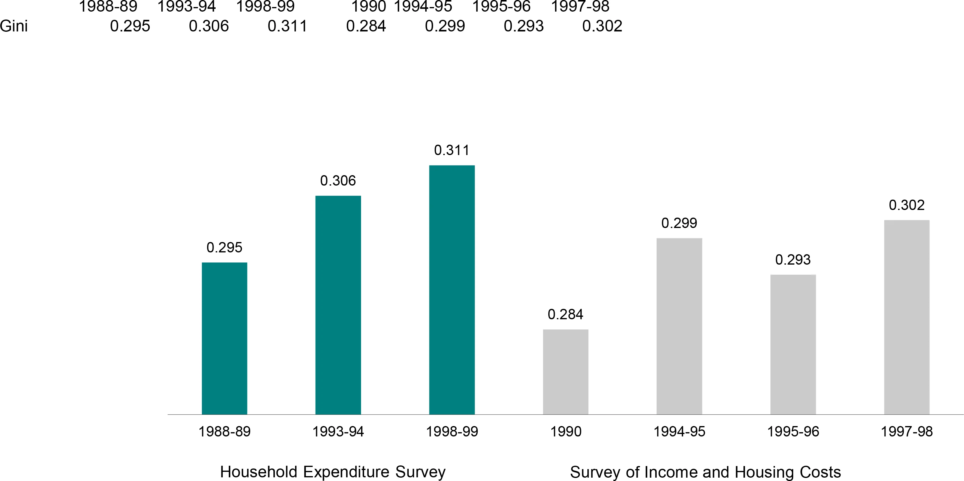
While the ABS has not yet released the 1999-2000 income survey unit record file, its published estimates suggest that the relevant Gini coefficient did not increase above the 1997-98 level by a statistically significant amount (Saunders, 2001a; Saunders, 2001a; Saunders, 2001b). However, the changes in the Gini coefficient in the 1990s from both the expenditure surveys and the income surveys are statistically significant and in neither case do the Lorenz curves cross. Thus, results from both types of survey suggest that income inequality increased during the 1990s.
While both sets of figures produce the same story of increasing inequality during the 1990s, they differ from 1994 onwards. Although the Gini coefficients were equivocal, decile shares of income and income ratios from the expenditure surveys suggested that income inequality continued to increase after 1993-94 (Table 1). The contrast in the Gini coefficients from the 1994-95 and 1995-96 income surveys makes it difficult to interpret whether inequality increased during this later period. However, between 1994-95 and 1997-98, there is no statistically significant change and, unsurprisingly, the Lorenz curves cross (confirming that no conclusion can be drawn from the Gini coefficients about a change in inequality).
The income surveys also tell a somewhat different story about what is happening at various points within the income distribution (Table 2). Relative to the expenditure surveys, the income surveys suggest that:
the bottom fared better;
the middle fared worse;
the top did not fare as well as indicated in the expenditure surveys; and
inequality did not change between 1994-95 and 1997-98.
| 1990 | 1994-95 | 1995-96 | 1997-98 | Change 1990 to 1997-98 | |
|---|---|---|---|---|---|
| Income at points in the distribution | $ | $ | $ | $ | % |
| 95th percentile | 1 967 | 2 021 | 1 959 | 2 121 | 7.9 |
| 90th percentile | 1 709 | 1 722 | 1 672 | 1 843 | 7.8 |
| 75th percentile | 1 326 | 1 314 | 1 310 | 1 390 | 4.9 |
| Mean | 1 025 | 1 019 | 998 | 1 073 | 4.7 |
| Median | 944 | 925 | 912 | 956 | 1.3 |
| 25th percentile | 624 | 597 | 589 | 625 | 0.1 |
| 10th percentile | 443 | 424 | 417 | 449 | 1.5 |
| 5th percentile | 364 | 354 | 348 | 376 | 3.2 |
| Ratios | |||||
| 95:10 (very top:bottom) | 4.44 | 4.77 | 4.69 | 4.72 | 6.3 |
| 90:10 (top:bottom) | 3.86 | 4.06 | 4.01 | 4.10 | 6.3 |
| 90:50 (top:middle) | 1.81 | 1.86 | 1.83 | 1.93 | 6.4 |
| 50:10 (middle:bottom) | 2.13 | 2.18 | 2.18 | 2.13 | -0.1 |
| Decile shares | % | % | % | % | |
| Bottom 10% | 3.1 | 3.0 | 3.1 | 3.0 | -3.1 |
| Middle 20% | 18.3 | 18.2 | 18.2 | 17.8 | -2.7 |
| Top 10% | 20.9 | 22.0 | 21.4 | 22.0 | 5.6 |
Note: The Lorenz curves cross between 1994-95 and 1997-98. Consequently, no conclusion can be drawn about the change in inequality during this period. All incomes have been adjusted for inflation to March 2001 dollars. The income measure is the international equivalent weekly disposable household income of individuals.
Source: ABS Household Expenditure Survey and income survey unit record files.
However, there is still some consistency within the results, in that the top experienced larger gains in income than did either the bottom or the middle during the 1990s. The two sets of results also suggest that during this period the income share of both the middle and the bottom decreased and the income share of the top 10 per cent increased (Table 2).
4. Expenditure inequality
It is sometimes argued that expenditure is a better guide to the economic wellbeing of households than income because households are able to smooth transitory fluctuations in income by borrowing and saving (see, for example, Tsumori et al., 2002). Thus it is valuable to compare income and expenditure inequality to determine whether this methodological choice alters apparent levels or trends in inequality. The Household Expenditure Surveys allow this comparison because they contain both income and expenditure data, whereas the income surveys do not collect expenditure data. Analysis of HES expenditure data also ensures that comparisons can be made back to the mid-1980s because the 1984 expenditure data are not affected by problems with the imputation of income tax.
The following discussion of expenditure inequality is divided into four parts. First, we study the differences in income and expenditure inequality and compare our results with those from other recent studies of Australian expenditure inequality. Second, we comment on the trends in expenditure inequality revealed by changes in the Gini coefficient. At this point, we pause to discuss different possible measures of expenditure and the difficulty of accounting appropriately for spending on consumer durables. Finally, we supplement the earlier trend analysis by examining changes in decile shares.
In theory, it might be expected that expenditure would be more equally distributed than income, given that high income people do not spend all of their income and low income people typically spend more than their income (for example, by drawing down past savings). Previous studies of expenditure inequality tend to support this view. For example, a study using the Canadian Family Expenditure Survey over a number of years found that expenditure on non-durable items was more equally distributed than income in every year, with the difference being about 0.020 of a Gini coefficient (Pendakur, 1998, p. 266). An Australian study using the HES data also found that expenditure inequality was less than income inequality (Barrett et al., 2000). However, this result for Australia was derived from a modified HES dataset that excluded the top and bottom 3 per cent of observations and all households with a head aged less than 25 years or more than 49 years. This study also adopted a restricted measure of expenditure that excluded some consumer durables (see further discussion of expenditure measures below).
The results in this study for 1993-94 and 1998-99 also support the expected relationship between current expenditure and income, but in 1984 the Gini coefficients for income and expenditure are the same and in 1988-89 the Gini coefficient for expenditure is higher than that for income (Table 3). There are some similarities between our results and another Australian study of expenditure inequality by Blacklow and Ray (2000, p. 324). The methods used by Blacklow and Ray differ significantly from those used in this report.1 Despite these differences in methodology, they also found that expenditure was more unequal than income in 1984 and 1988-89, but that expenditure was more equal than income in 1993-94.
| 1984 | 1988-89 | 1993-94 | 1998-99 | Change 1984 to 1998-99 | |
|---|---|---|---|---|---|
| Gini coefficients* | % | ||||
| Equivalent disposable income | 0.298 | 0.295 | 0.306 | 0.311 | 4.4 |
| Equivalent current expenditure | 0.298 | 0.301 | 0.297 | 0.302 | 1.3 |
| Equivalent total expenditure | 0.334 | 0.360 | 0.362 | 0.351 | 5.1 |
| Equivalent non-durable expenditure† | na | 0.275 | 0.271 | 0.277 | 0.7 |
| Share of bottom quintile | % | % | % | % | |
| Disposable income | 8.2 | 8.1 | 8.0 | 7.4 | -10.3 |
| Current expenditure | 8.3 | 7.9 | 8.3 | 8.2 | -0.9 |
| Total expenditure | 6.8 | 5.1 | 5.7 | 6.0 | -12.6 |
| Share of middle quintile | % | % | % | % | |
| Disposable income | 17.6 | 17.8 | 17.4 | 17.6 | -0.3 |
| Current expenditure | 17.4 | 17.6 | 17.4 | 17.4 | -0.4 |
| Total expenditure | 17.1 | 17.5 | 16.9 | 17.1 | -0.5 |
| Share of top quintile | % | % | % | % | |
| Disposable income | 37.8 | 37.4 | 38.2 | 38.2 | 1.1 |
| Current expenditure | 38.1 | 38.0 | 38.0 | 38.3 | 0.5 |
| Total expenditure | 40.3 | 41.2 | 42.0 | 41.2 | 2.3 |
Note: The income and expenditure measures are the international equivalent disposable household income and expenditure of individuals.
Source: ABS Household Expenditure Survey unit record files.
The Lorenz curves cross in the following cases: for disposable income between 1993-94 and 1998-99; for current expenditure for all cases except between 1984 and 1998-99; and for total expenditure between 1988-89 and 1993-94, between 1988-89 and 1998-99 and between 1993-94 and 1998-99. Consequently, no conclusion can be drawn about the change in inequality during these periods.
Durable items are defined in appendix B. Non-durables items are all other items. Note that the Lorenz curves for non-durable expenditure have not been checked to determine whether they cross.
The trends in current expenditure inequality also differ from the income inequality trends (Table 3). The Gini coefficients are remarkably constant for the 15-year period, so much so that the Lorenz curves cross for every period except from 1984 to 1998-99. Even in this case, the change in the Gini coefficient is so small it is unlikely to be statistically significant. These results indicate that current expenditure inequality has remained unchanged for a long time.
The preceding discussion has focused on inequality in current expenditure on goods and services (such as food, recreation and transport). As noted in appendix A, the ABS collects data not only on current expenditure but also on some capital expenditure (which comprises saving via home loan principal reductions, superannuation and life insurance contributions, and capital housing expenses such as the purchase of investment properties and the installation of swimming pools). Total expenditure is the sum of current and capital expenditure. If capital expenditure is included in the picture, in each of the four years examined in Table 3, total expenditure was more unequally distributed than income. In addition, the results suggest that total expenditure inequality increased between 1984 and 1998-99 (Table 3).
It thus appears that over the whole period (from 1984 to 1998-99), while the inequality of expenditure on goods and services remained constant, the inequality of total expenditure increased. This perhaps reflects the growing ability of those at the top end of the income spectrum to invest in property and their own home as a result of their real income increases. For other periods, crossed Lorenz curves obstruct the drawing of clear conclusions about changes in total expenditure inequality.
Expenditure measures do not depend only on the distinction between expenditure on goods and services and on capital expenses. The difference between durable and non-durable goods and services is equally important, if not more so.2 For example, non-durables include food, petrol or renting a video whereas durables refer to items such as fridges, cars or stereos. The distinction is important because the ‘acquisitions approach’ to measuring expenditure used by the ABS means that, for any given period, a household’s expenditure on durable items can be very different from its consumption. For instance, a household that purchased a car before the survey period would be consuming car services but would report no expenditure on a car purchase, so that this household’s consumption would be understated. There is a strong random element to whether a household reports buying many durable items during the survey period, and therefore whether the household’s consumption is overstated or understated.
Because of the number of households in the sample, the expectation is that the HES acquisitions approach provides reasonable estimates of expenditure across reasonably large population subgroups. However, it is possible that the approach may produce distorted measures of expenditure inequality. For example, it may be that a low income household looks affluent because, after saving for a long period, it happens to make a big purchase during the HES survey period. Conversely, a high income household may appear to have low consumption if it is surveyed after purchasing a range of expensive consumer durables and during a period when it is reducing spending to restore its savings.
One way to test for possible distortion is to compare the rankings of individuals when they are ranked first into deciles of current household expenditure and then into deciles of non-durable current household expenditure.3 We would not expect these rankings to be the same but we assume that, in the absence of any distorting effects, the rankings will be similar. Specifically, we assume that the ranking of most individuals will remain unchanged and that, for the remainder, almost all will move up or down only one decile. The movements in decile rankings derived from the 1998-99 expenditure survey are set out in a ‘mobility matrix’ (Table 4). The matrix indicates that, given the previously stated assumptions, there is some distortion: less than half of all individuals remain in the same decile and more than 10 per cent move by more than one decile. A very similar pattern was found in the 1988-89 and 1993-94 expenditure surveys.
| Decile of equivalent current non-durable expenditure* | ||||||||||
|---|---|---|---|---|---|---|---|---|---|---|
| 1 | 2 | 3 | 4 | 5 | 6 | 7 | 8 | 9 | 10 | |
| Decile of equivalent current expenditure | % | % | % | % | % | % | % | % | % | % |
| 1 | 8.57 | 1.30 | 0.04 | 0.03 | 0.01 | 0.02 | 0.00 | 0.00 | 0.01 | 0.01 |
| 2 | 0.70 | 6.03 | 3.11 | 0.11 | 0.02 | 0.01 | 0.03 | 0.00 | 0.00 | 0.00 |
| 3 | 0.16 | 1.48 | 4.40 | 3.92 | 0.02 | 0.00 | 0.01 | 0.00 | 0.00 | 0.00 |
| 4 | 0.18 | 0.58 | 0.97 | 3.44 | 4.65 | 0.16 | 0.00 | 0.01 | 0.00 | 0.00 |
| 5 | 0.07 | 0.18 | 0.63 | 1.14 | 3.06 | 4.57 | 0.34 | 0.01 | 0.00 | 0.00 |
| 6 | 0.11 | 0.18 | 0.39 | 0.72 | 0.94 | 2.91 | 4.47 | 0.29 | 0.00 | 0.00 |
| 7 | 0.09 | 0.10 | 0.27 | 0.30 | 0.70 | 1.09 | 2.68 | 4.55 | 0.20 | 0.00 |
| 8 | 0.06 | 0.07 | 0.11 | 0.15 | 0.39 | 0.70 | 1.54 | 2.85 | 4.10 | 0.01 |
| 9 | 0.02 | 0.10 | 0.03 | 0.10 | 0.13 | 0.39 | 0.77 | 1.68 | 4.12 | 2.65 |
| 10 | 0.00 | 0.01 | 0.04 | 0.05 | 0.10 | 0.14 | 0.18 | 0.59 | 1.56 | 7.36 |
Note: Expenditure measures are the international equivalent disposable household expenditure of individuals.
Source: 1998-99 ABS Household Expenditure Survey unit record file.
Durable items are defined in appendix B. Non-durable items are all other current expenditure items.
What is the impact of the ‘durables effect’? The Gini coefficients for non-durable expenditure in Table 3 are consistently significantly lower than the coefficients for current expenditure. For example, in 1998-99 the Gini coefficient for non-durable current expenditure of 0.277 is substantially lower than the Gini coefficient for current expenditure of 0.302. This is to be expected because many durables are luxury items (for example, jewellery, boats, golf equipment and cars) that are purchased disproportionately by households at the top end of the distribution. In theory, if the acquisitions approach to expenditure measurement causes spending on durables to be distributed somewhat randomly, this might tend to even out the consumer durables expenditure across the distribution. This would lead to an understatement in inequality at any point time. Unfortunately, we were unable to devise a simple method for testing this hypothesis.
Perhaps the more important question relates to the effect of durables on inequality trends. Here the news is surprisingly good: the movements in the Gini coefficients for non-durable and current expenditure are almost identical (Table 3). This consistency is also present in the mobility matrices for each year, strongly suggesting that the impact of the ‘durables effect’ is stable over time. Consequently, the ‘durables effect’ should not undermine our earlier conclusion that current expenditure inequality was stable between 1984 and 1998-99.
In summary, Table 3 suggests that the inequality of disposable income and total expenditure increased between 1984 and 1998-99 but that, in the case of current expenditure, inequality did not vary significantly. How do these results compare with the two academic studies using the same data by Blacklow and Ray, and Barrett et al.? Both of these studies used the 1975 HES data, but we feel these data are not sufficiently comparable and they have not been used in this study. Despite the differences in methodology — and summarising a wide range of results using different equivalence scales and inequality measures — the two previous studies (Blacklow and Ray, 2000; Barrett et al., 2000) and this study essentially agree that between 1984 and 1993-94 income inequality increased whereas current expenditure remained stable. The recently released 1998-99 HES data, which were not available to the authors of the earlier studies, merely serve to confirm the continuing stability of current expenditure inequality.
What are the shares of expenditure by decile? In interpreting these results it is important to distinguish between income deciles, which were used in the previous section, and expenditure deciles used here. The difference is whether the population is ranked by their equivalent income or expenditure before being divided into 10 groups of equal number. It is possible for a household to be in income decile 1 but expenditure decile 4. As noted earlier, the 1984 expenditure results are not subject to the same uncertainty as the 1984 income results, as imputed income tax is not included in the definition of expenditure.
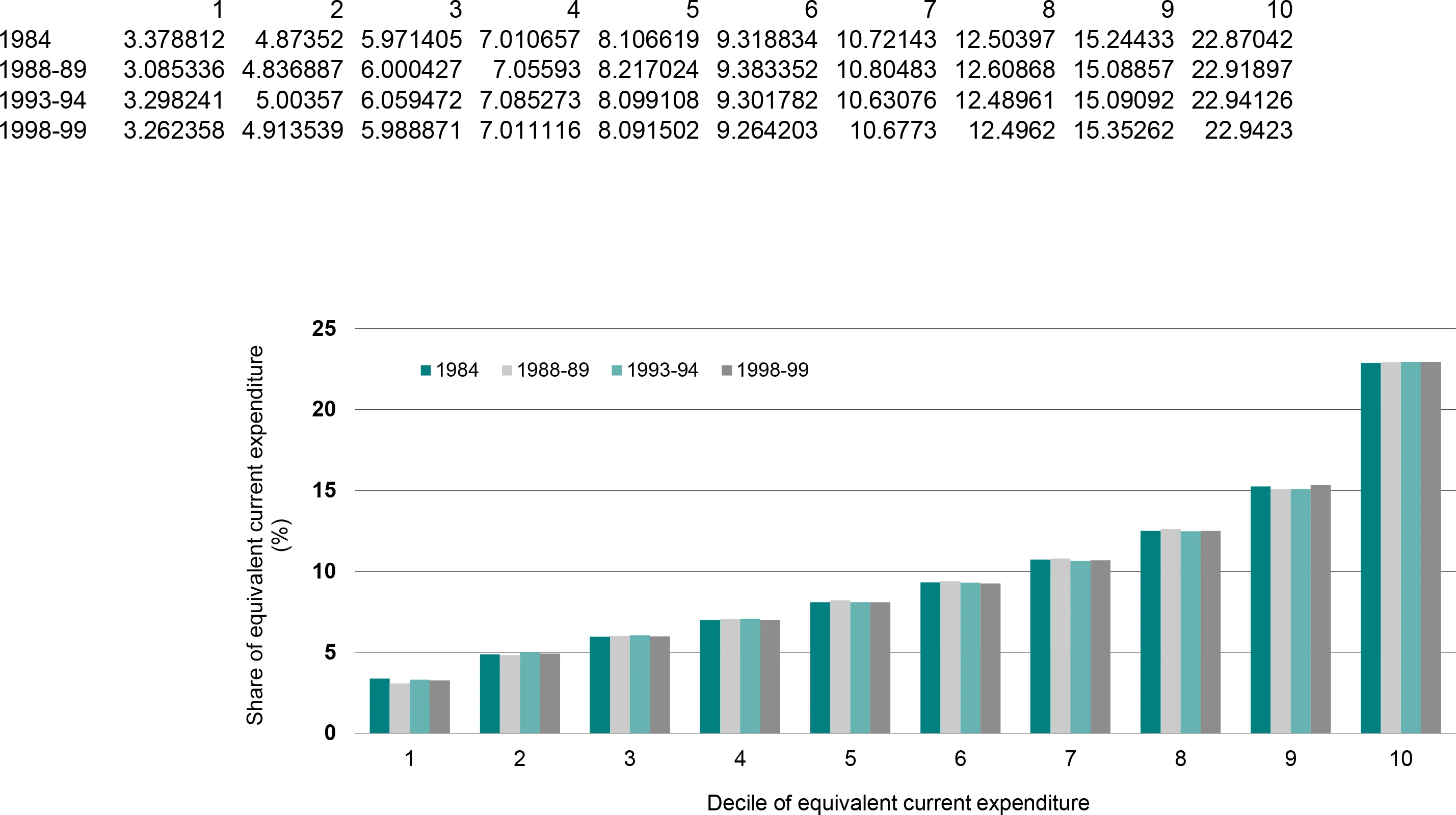
If we look at only the results for 1984 and 1998-99, each decile’s share of total current expenditure is almost the same (Figure 5). This is also reflected in the Gini coefficient, which shows a statistically insignificant increase from 0.298 to 0.302. This consistency in the Gini coefficient reflects the minimal changes in the expenditure shares of the top decile (which experienced a very slight increase) and the bottom decile (which experienced a very slight decrease). Overall, the results suggest that, while income inequality increased appreciably after 1984, current expenditure inequality did not.
Once capital expenditure is included, however, the picture is different again. Including this form of saving results in the Gini coefficient for total expenditure increasing more rapidly between 1984 and 1998-99 than that for income (Table 3). An examination of Figure 6 suggests that the key driver of this apparent increase in total expenditure inequality was the sharp fall in the bottom decile’s share of total expenditure between 1984 and 1998-99. The fall between 1984 and 1988-89 is so pronounced that it suggests a possible issue with the 1988-89 data — perhaps related to the treatment of negative expenditure. The comparability of the 1984 and the 1990s data may also be affected by the ABS’s move from a ‘payments approach’ to an ‘acquisitions approach’ for measuring expenditure (ABS, 1995).
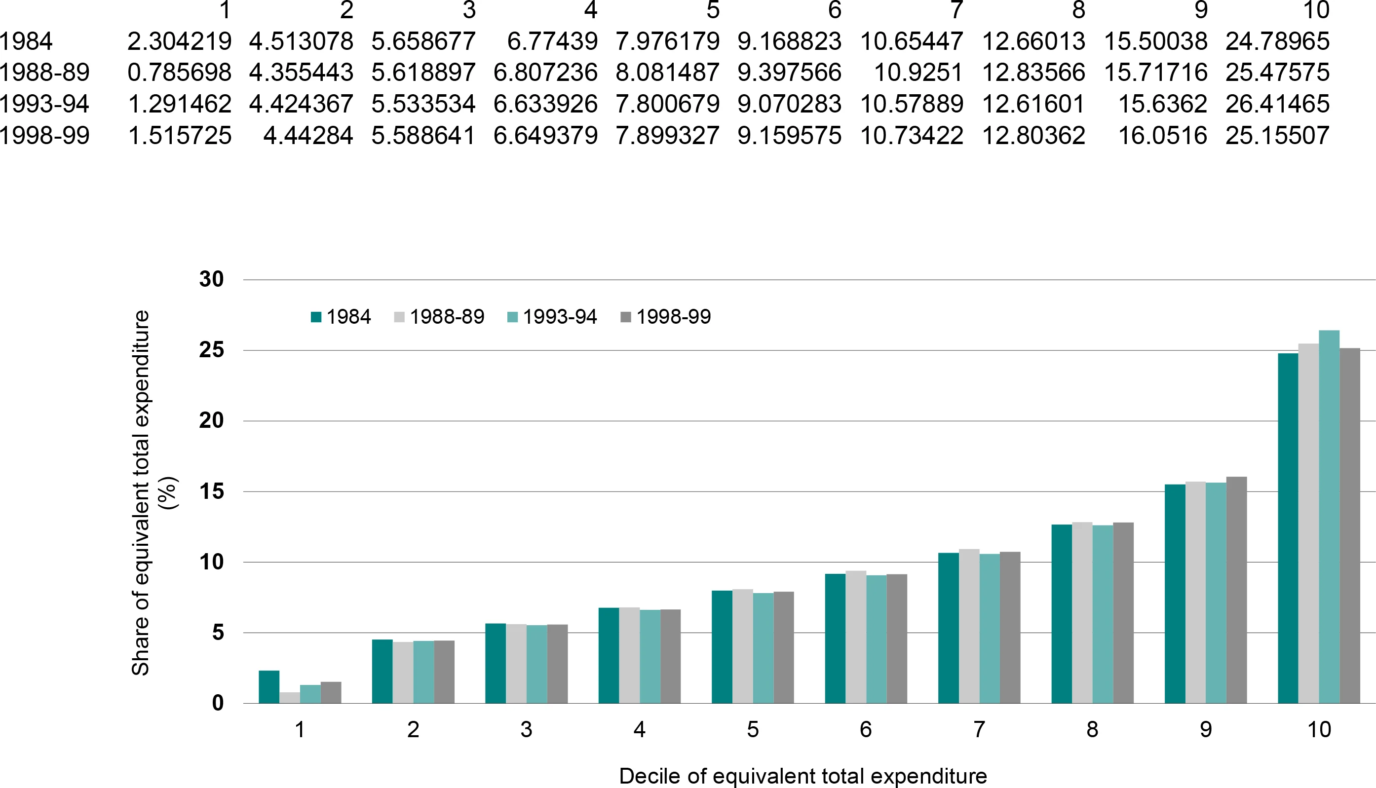
Table 3 summarises the changes in quintile shares. The results suggest that the shares of both the bottom and middle quintiles declined between 1984 and 1998-99 for all three measures of wellbeing, while the share of the top quintile increased for all three measures of wellbeing. Again the known problems with comparability of the income data and possible problems with the comparability of the expenditure data need to be emphasised.
5. Expenditure of different income groups
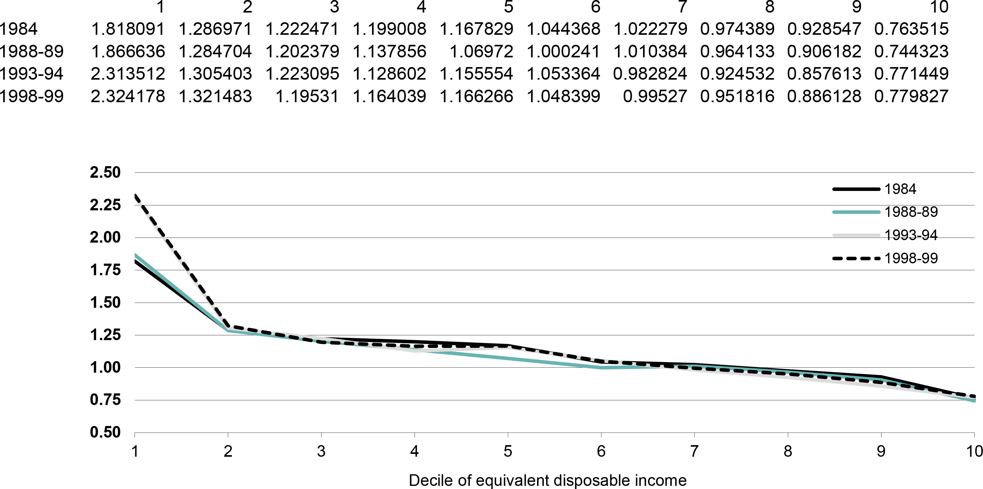
Another interesting issue is the expenditure of Australians once they are ranked by their equivalent disposable income. Figure 7 suggests that the current expenditure of the bottom decile, divided by their income, was the same in 1993-94 as in 1998-99, at about 2.3. In other words, the bottom decile was spending about 2.3 times its income in these years. However, there was a dramatic difference between the two later surveys and the two earlier surveys for the bottom decile. For the remaining deciles, the ratio was remarkably similar in all four of the surveys.
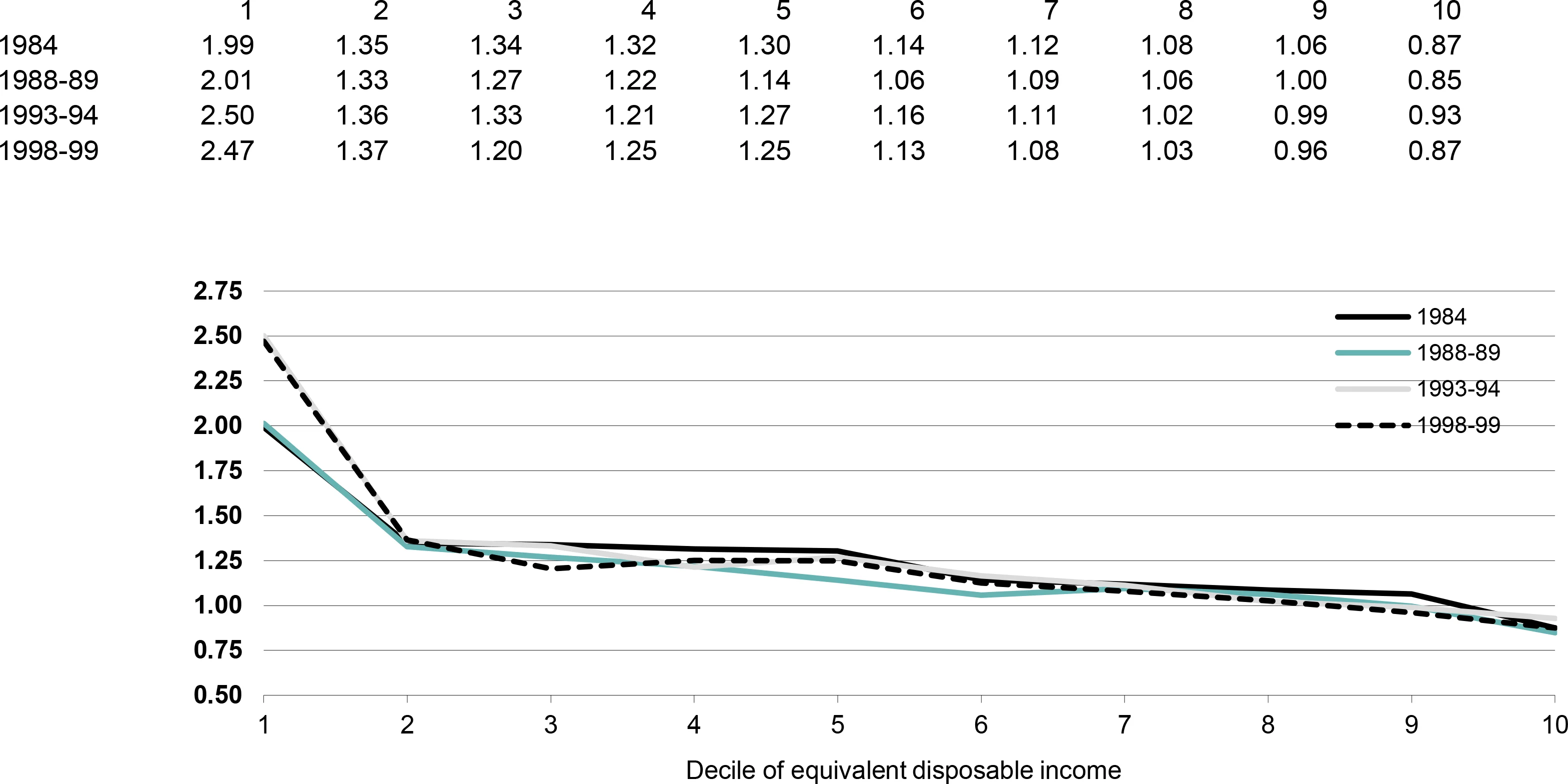
Much the same relationship is apparent between equivalent disposable income and equivalent total expenditure (Figure 8). Once again, the results for the bottom decile match for 1984 and 1988-89 and for 1993-94 and 1998-99. However, the ratio of total expenditure to income of the bottom decile was much greater in the two later years. For the remaining deciles, all four surveys suggest much the same relationship between total expenditure and total income.
Why was the bottom decile spending so much more than its income, particularly in the later years? Given the looser relationship between income and spending for the self-employed, one possibility is that there were more people who were self-employed in the bottom decile. In fact, the proportion of the bottom decile where either the head or the spouse was self-employed remained at 19 per cent between 1988-89 and 1998-99.
A second possibility was that there were more aged persons in the bottom decile who were drawing down savings to finance their expenditure. To test this, ‘retired households’ were identified where the household head was aged 65 years or more at the time. The proportion of the bottom decile that were retired households increased steadily across the four surveys — from 19 per cent in 1988-89 to 24 per cent in 1998-99. So this does seem to be one possible explanation.
Another possibility is that the composition of the bottom decile changed, with social security dependent families with children moving out and being replaced by working age households without children. It is possible that such households if in employment might have greater access than social security dependent households to credit cards and other loan sources to finance their expenditure.
The average number of dependent children in bottom decile households dropped rapidly from 1.45 in 1988-89 to 1.06 in 1998-99 — about four times the drop apparent for all households. So, relatively speaking, children moved out of the bottom decile. If we look at just the population who were not dependent children, the average number per household fell by 0.03 between 1988-89 and 1998-99. But the picture for the bottom decile was very different, with the average number of adults increasing by 0.04.
The story for the number of earners is a little more complex. Suppose we look at the average number of earners in each household, thus including both full-time and part-time earners. For all Australian households, the average number of earners fell by 0.03 between 1988-89 and 1998-99. The only deciles for which the average number of earners increased were deciles 1, 8 and 10. This trend is reflected in both average wage and salary income and average earned income received by the bottom decile. In March 2001 dollars the average wage and salary income of bottom decile households fell by $13 a week from 1988-89 to 1990, while deciles 2–4 sustained losses of $58 to $85 a week. Similarly, while earned income (including self-employment income) of decile 1 fell by $26 a week, deciles 2–4 experienced a drop of between $77 and $98. (Average real ‘earned’ and ‘wage and salary’ income increased during the 1990s for all households, so the losses of the bottom half of the distribution were more than outweighed by the gains of the top half.)
Finally, average government cash benefits received by the bottom decile fell by $5.60 a week between 1988-89 and 1998-99. This was in sharp contrast to the average increases in government cash benefits for deciles 2–4, which ranged from $76 to $102 a week.
Although further exploration is needed, this suggests a significant change in the composition of the bottom decile, with social security dependent families with children moving out, and couples and singles without children and often in low wage full-time or part-time employment moving in. Perhaps the bottom decile contains more of the working poor without children than it did at the beginning of the 1990s. It seems possible that such a group might have better access to credit than welfare-dependent families with children, and that this is one of the factors underlying the sharp change in the relationship between income and expenditure for the bottom decile. Thus, such groups might be demonstrating an ability to maintain their consumption in the face of temporary income shocks. Interestingly, Blacklow and Ray (2000, p. 323) found that ‘the propensity to smooth consumption, in the face of exogenous income shocks by drawing on savings or borrowing, is at its highest for single adults with no dependent children’.
These conclusions may be affected if, as the ABS has very recently indicated, the 1998-99 HES data understate the income of the lowest income quintile by about 11 per cent. The ABS expects to release a modified HES unit record file (ABS, 2002, p. 7).
6. Summary
This paper’s results must be treated with caution given the changes in the methodology of the expenditure and income surveys over time, our relatively unsophisticated imputation of income tax for 1984, the unusually low expenditure by the bottom decile of households in 1988-89, and the ABS’s recent statement that it has concerns about the quality of the 1998–99 data.
With these caveats in mind, the following interim conclusions emerge.
It appears that income inequality increased between the late 1980s and mid-1990s and there is some evidence to suggest that it has continued increasing since then.
The increase in inequality was driven by declines in the income shares of the bottom 10 per cent and, to a lesser extent, the middle 20 per cent of Australians during the 1990s, and an increase in the income share of the top 10 per cent.
The inequality of expenditure on current goods and services did not change significantly over the period 1984 to 1998-99.
The inequality of all expenditure (including ‘savings’ via expenditure on investment properties, superannuation, etc.) increased between 1984 and 1988-89 but apparently decreased between 1988-89 and 1998-99.
A separate analysis examined the relationship between the income and expenditure of Australians after they were ranked into deciles of equivalent disposable income. This suggested a remarkably consistent relationship between spending and income for each income decile. The only area of major change was the sharp increase in the spending-to-income ratio of the bottom decile. This was not due to growing numbers of self-employed households in the bottom decile. Instead, it seems that the composition of the bottom decile had changed — more retired and childless ‘working poor’ households, and fewer social security dependent households with children. Thus it is possible that the entrants to the bottom decile had greater capacity than social security families with children to run down savings or to borrow to finance their spending, and that this had propped up the spending of the bottom decile in the face of their declining share of income.
Footnotes
1.
First, they used a different equivalence scale. Second, they added negative expenditure values (for example, from selling a car) to income, and then set the negative expenditures to zero. This seems to be inconsistent with the ‘acquisitions approach’ used by the ABS to collect expenditure data (see ABS, 2000). Third, they ranked households rather than individuals, on the grounds that it could not be assumed that ‘resources are equally shared within the household’ (Blacklow and Ray, 2000, p. 325). In other words, when constructing their inequality rankings, they counted a household with five people in it just once, whereas we counted it five times. In technical terms, this means that their results were ‘household weighted’ whereas our results are ‘person weighted’, which is the preferred approach in analysis of income inequality changes over time (Danziger and Taussig 1979). Furthermore, Blacklow and Ray used the household as their unit of analysis and this typically implies an assumption that resources are equally shared within the household (see, for example, ABS, 2000).
2.
For discussion of its importance and implications, see Wright and Dolan (1992) and ABS (2000).
3.
Durable items are defined in appendix B. Non-durables items are all other items.
4.
In the original 1988-89 HES CURF file, income tax was ‘as reported’ but an ‘entirely imputed’ income tax variable is available from the Fiscal Incidence Study CURF file for the same year. This means that the 1988-89 income tax variable is consistent with that in the later HESs.
5.
Blacklow and Ray (2000) also imputed income tax onto the 1984 HES, but not onto the 1975 HES. However, the publicly released HES data are only at the household level, which means that only the ABS has the capacity to do a sophisticated tax imputation as this requires access to the original person records collected as part of the survey. For example, three taxpayers within a household each earning $50 000 will pay a different amount of tax to a household where one person earns $150 000 and two others earn nothing.
6.
This is particularly evident if, as suggested, the result for 1996-97 is treated as an outlier. Alternatively, if the 1996-97 result is retained, there is the appearance of considerable fluctuation in inequality, without a clear trend.
7.
The international scale points for an income unit are equal to the square root of the size of the income unit. OECD equivalence scale points are as follows: 1.0 for the income unit reference person; 0.5 for the partner of the reference person; 0.3 for each of the other members of the income unit. The simplified Henderson scale is more detailed, accounting for labour force status and housing costs. The relevant points are given in Commission of Inquiry intoCommission of Inquiry into Poverty (1975, pp. 354–6).
8.
The simplified Henderson scale was not applied to the HES, partly because it is more time consuming to calculate and partly because of concerns about the accuracy of the HES data on dependent children.
Appendix A
Data and methodology
Data
The Australian Bureau of Statistics conducts two major surveys on income and expenditure: the Survey of Income and Housing Costs (SIHC), previously the Income Distribution Survey (IDS), and the Household Expenditure Survey (HES). The ABS has released unit record files for five expenditure surveys and seven income surveys. Each of these surveys was examined for the purpose of this study but, owing to issues of data quality and comparability, only eight were used. The following notes briefly describe our concerns about data quality and comparability and what we have been able to do to address them. They also describe what we have done to ensure that results from each expenditure survey are comparable, and similarly for each income survey.
One issue of comparability for the expenditure surveys and for the income surveys is that until the early 1990s negative business and investment incomes were not recorded (that is, they were recorded as zero income). Consequently, in later surveys negative incomes have been set to zero and gross incomes have been increased accordingly. There is conflicting evidence about the impact of this change (see ‘Testing the inequality results for sensitivity to methodology’ later in the appendix for details).
It must also be emphasised that for both the income and the expenditure surveys there are a number of differences in the survey methodology adopted during the 1980s and 1990s, including in the scope of the surveys and in the definitions of income (ABS 1995). It has not been possible to amend the data to fully account for these differences. Despite this, the scope of the most recent SIHC is fairly consistent with past income surveys, and similarly for the HES. Indeed, the scope of the HES and the SIHC is substantially the same (see ABS 1997; 2000 for details). First, the surveys are restricted to people living in private dwellings. These dwellings include houses, flats, home units, caravans and garages but excludes ‘special dwellings’ — hotels, boarding houses and institutions (for example, gaols or hospitals). The homeless were also omitted from these surveys, thereby ensuring that the following results fail to capture a group who are almost certainly at the bottom of the income distribution. Second, the survey population excludes Australian and non-Australian defence force personnel and diplomatic personnel of overseas governments and overseas residents. Third, the scope of the surveys excludes people living in ‘remote and sparsely settled areas’ (approximately 175 000 people in 1996-97). Finally, unit record files have weights attached, indicating what proportion of the population each record represents.
Household Expenditure Survey
Two issues arose in relation to the Household Expenditure Survey. In general, there appear to be a range of questions about the accuracy and comparability of the five HES unit record files released publicly by the ABS. A range of checks on the 1975-76 data eventually suggested that its quality was not as good as the data collected for later years. For example, according to the survey, average real equivalent gross and disposable incomes were much the same in 1975-76 as in 1998-99, despite extended periods of economic growth during this time.
The second issue that arose relates to the imputation of income tax. In the 1975-76 and 1984 surveys, income tax was ‘as reported’ by the household with some imputation by the ABS. Such an approach sometimes results in households with low current incomes reporting relatively high income tax payments, as the tax payments relate to earlier periods when they enjoyed higher incomes. In the three surveys 1988-89, 1993-94 and 1998-99 income tax was entirely imputed by the ABS, based on the reported current taxable incomes of households.4 In the 1984 Fiscal Incidence Study the ABS did go back and impute income tax for each of the HES households, and these estimates formed the basis of the estimates of income tax paid by gross income decile reported by the ABS (1987, p. 22). Our exploration of the data suggested that the ‘as reported’ income tax amounts are sufficiently different from the ‘entirely imputed’ income tax amounts that surveys using different approaches should not be compared. Thus, we believe that the 1984 results are not comparable with those of the later surveys if the ‘as reported’ tax variable on the public unit record file is used. As an interim measure we have run a regression equation through the published ABS (1987, p. 22). estimates in the 1984 Fiscal Incidence Study and used the resulting coefficients to impute income tax to each household in the 1984 HES. Checks suggested that the results are far more consistent with the results for later years. It was not possible to use the same methodology to re-impute income tax in 1975-76, and this became a second reason for not using the 1975-76 data.5
Income surveys
There are three points to note about the income surveys. The first is that the interviews for the 1982, 1986 and 1990 IDSs were conducted largely in the December quarter of each year, whereas thereafter the interviews were conducted throughout the financial year. Consequently, references to 1982 and 1990 should perhaps more strictly be interpreted as references to the December quarter of those years. (The interviews for the HESs were all conducted throughout the financial or calendar year indicated.) Where incomes are reported for these years and are CPI-adjusted, the December quarter CPI was used for the earlier years and the annual average was used otherwise.
Second, results for two years — 1982 and 1996-97 — are reported in only this appendix because we were concerned about the data quality in those years. It has been reported that in the 1982 results the relationship between annual and current (that is, weekly) incomes in 1982 does not match the relationship for other years. In 1982 current income is markedly more unequal than annual income, which is why studies using annual income have reported increasing inequality since 1982 (Saunders, 1993; Harding, 1996), while those using weekly income have reported stable inequality over some periods (Harding, 1997).
The results for 1996-97 have been excluded from the body of this paper because they appear anomalous, suggesting significant fluctuations in inequality from 1995-96 to 1996-97 and from 1996-97 to 1997-98. The apparent discrepancy between the results of the 1996-97 survey and earlier and later surveys increases when the results are person-weighted. Issues about the comparability of the income survey data are currently being investigated in a joint project of the ABS and the Social Policy Research Centre.
The 1990 survey was reweighted by NATSEM following concerns about the original weights (Landt et al., 1994). The 1986 survey was not used because imputed current weekly income tax was not calculated by the ABS and the results therefore cannot be compared with earlier and later surveys. NATSEM imputed current income tax for the 1982 survey.
Methodology
Measuring inequality involves making numerous methodological decisions. In brief, these decisions involve answering the following questions.
Indicator of resources: What is the best way to measure a person’s standard of living?
Unit of analysis: Because we assume that, in many cases, income and expenditure are shared, what is the best group among whom to assume income or expenditure is shared?
Equivalence scale: What scale do we use to compare households or income units of different size and composition?
Method of ranking: Should inequality be based on a ranking of income units or a ranking of persons?
Measure of inequality: What is the best way to determine whether inequality has changed?
Inevitably, the choice of methodology will influence the results. In several instances, the sensitivity of the results is considered explicitly in the body of this paper. In other instances, sensitivity is examined later in this appendix.
Indicator of resources
A person’s standard of living may depend on many intangible factors such as the presence of loving friends and relatives, the degree of satisfaction derived from work, study and other activities and the different goals that we each strive for. Such factors are difficult, if not impossible, to measure directly and so measurement of inequality relies on finding some proxy that can give a reasonable approximation of each person’s standard of living. Saunders (1994, chs 6 and 7) surveys a range of possibilities, including gross income, disposable (that is, after-tax) income and the ‘social wage’ (that is, disposable income plus non-cash government benefits such as health and education). This study produces inequality results for disposable income.
A further complication is that income is sometimes regarded as an indirect measure of the standard of living, with expenditure providing a better reflection of an individual’s wellbeing (for an example of this view, see Barrett et al., 2000). This study thus looks at trends in the inequality of both income and expenditure. The ABS divides expenditure into two broad types — current and capital expenditure. Current expenditure is expenditure on goods and services, such as food, rent, utilities, entertainment and personal care. Capital expenditure comprises the repayment of the principal on own home, the purchase of investment properties, home improvements, superannuation and life insurance (and can thus be seen as a form of household ‘saving’ rather than ’expenditure’). Total expenditure includes both current and capital expenditure by households.
Unit of analysis
It is commonly assumed in inequality studies that income (and expenditure) is shared among some household or family members and therefore that the relevant income (or expenditure) to compare when measuring inequality is that of this ‘sharing group’ or unit of analysis. Australian income inequality studies have overwhelmingly adopted the ABS income unit.
A common problem is that as dependent children get older they gradually gain greater independence but the exact point at which they are predominantly self-sufficient will vary greatly among families. This suggests that the unit of analysis that effectively assumes complete sharing within the unit may often be too broad because it includes people among whom there remains little income sharing. By contrast, young people living away from home (who are therefore treated as separate families or households) may well still receive substantial support from their parents and thus not really be independent units. Similarly, it has been argued that different cultural attitudes towards income sharing, particularly among indigenous communities, often mean that income is shared much more widely than the nuclear family or even the household (Hunter 1999, p. 7; Hunter, Kennedy and Smith 2001, p. 3).
A further reason for analysing different income units is that it need not be the case that the ‘income sharing group’ and the ‘expenditure sharing group’ are the same. Indeed, this possibility is reflected in the fact the ABS collects its expenditure data at the household level, but conducts its income surveys at the income-unit level.
With this in mind, and for the purposes of comparability, the unit of analysis used in this study is the household. It is possible that other units might lead to different trends in inequality and this is examined later in this appendix. However, while it is relatively easy to measure household inequality from the income surveys, it is not possible to look comprehensively at ABS income units using the expenditure surveys. This is because only household-level variables are available for the 1984 HES and the ABS has not yet released the variable ‘income tax paid by each person’ for the 1998-99 HES.
Equivalence scale
In undertaking analysis of income trends, it is important to use equivalent (or needs-adjusted) income, which effectively takes account of the number of people that each household has to support. Because household size has been declining for the past three decades, failure to use equivalent income and expenditure may bias the results.
Investigation by NATSEM indicated that in some of the five expenditure surveys the number and ages of dependent children could not be accurately identified from the publicly available tapes. For example, in the 1993-94 HES there were discrepancies between the number of dependent children in various age ranges and the number of people within the household within comparable age ranges. In some of the earlier years the variable on the total number of dependants did not always appear consistent with the total gained after summing the number of dependants within various age ranges. Accordingly, it was decided that the number and ages of dependent children could not be ascertained with complete reliability. As a result, when calculating needs-adjusted household incomes, only the total number of persons living within the household could be used with confidence within the equivalence scale. The equivalence scale used was thus the square root of the total number of persons living within each household. This is an equivalence scale that has been adopted in a large number of international studies, including those by the OECD (Oxley et al. 2001).
Because we were interested in looking at changes in the number of dependent children over time, we constructed a new definition of a ‘dependent child’, which was all persons aged less than 18 years living in the household except where the young person lived by themselves, with a spouse or in a group household.
Method of ranking
All of the results in the study deal with individuals, ranked by the income or expenditure of the household within which they lived. As explained by Danziger and Taussig (1979), in undertaking analysis over time it is important to deal with individuals rather than income units or households so as not to bias the results in an era where household size is changing at a different rate at different points within the income spectrum.
Measure of inequality
There is a considerable literature on the merits of different measures of inequality (see, for example, Kakwani, 1980 and Barrett et al., 2000). None have received unanimous support. The three measures used in this paper have been chosen for their relative ease of interpretation and, to a lesser extent, their ease of calculation. One widely used summary measure of inequality is the Gini coefficient, which varies between 0 (when income is equally distributed) to 1 (when one household holds all income). Gini coefficients are derived from Lorenz curves, which compare the proportion of income (or expenditure) that is held by any proportion of the population. Thus, if income were distributed perfectly equally, the curve would be an increasing line: 10 per cent of the population would have 10 per cent of total income, 50 per cent of the population would have 50 per cent of total income, and so on. The Gini coefficient measures twice the area between this line of equality and the Lorenz curve and so, when the Gini is zero, the Lorenz curve is identical to the line of equality (hence, perfect equality).
It is not correct to assume that a higher Gini coefficient is necessarily associated with increasing inequality. If the Lorenz curves for two points in time do not overlap, then one is consistently closer to the line of equality, indicating an improvement in equality. However, if the Lorenz curves cross, the result is unclear: one part of the distribution will have improved while another will have worsened. Whether inequality has increased is a matter of judgment.
As it turns out, potential difficulties with the Lorenz curves do not greatly limit the results in this paper. Consider income inequality first. For the income inequality results derived from the expenditure surveys, the curves cross for 1993-94 and 1998-99 but evidence from other measures of inequality suggests that inequality continued to increase over this period. If, as suggested, we exclude the 1982 IDS and the 1996-97 SIHC from consideration, the only Lorenz curves that cross for the SIHC-based international scale household-level results are those for 1994-95 (Gini coefficient is 0.299) and 1997-98 (Gini coefficient is 0.302). The coefficients for these two years do not differ by a statistically significant amount anyway, so this does not constrain the analysis. The same argument holds for the analysis of current expenditure inequality: the curves cross for 1988-89 and 1998-99, for 1984 to 1993-94 and for 1988-89 to 1993-94. For total expenditure the Lorenz curves cross between 1988-89 and 1998-99 and between 1988-89 and 1993-94.
This paper also examines inequality as measured by ‘decile shares’ (the proportion of total equivalent income held by each decile of the population) and 90:10 ratios (the ratio of the income of the 90th percentile of the distribution to the income of the 10th percentile).
Testing the inequality results for sensitivity to methodology
This section of the appendix examines the robustness of the results to a number of methodological choices that are not explicitly considered in the paper itself — specifically, sensitivity to the unit of analysis, the data source and the equivalence scale. However, we first summarise the main findings about the sensitivity of the results to changes in the indicator of resources and the measure of inequality. The indicator of resources does influence the results. Expenditure inequality was consistently lower than income inequality and, whereas there was a distinct increase in income inequality over the 1990s, there was no increase in expenditure inequality over the same period. By contrast, the measure of inequality did not influence the results: each measure confirmed the trends of the others.
In addition to the sensitivity tests listed above, this appendix probes one further methodological point imposed by the data. As mentioned above, in earlier years of both the expenditure and the income surveys, no negative business or investment incomes were recorded. Consequently, for comparability over time, negative incomes in later years were set to zero. Although the effects of this change are discussed briefly above, they are tested further.
It should be noted that the following analysis is based on the Gini coefficient. A change in a Gini coefficient of 0.005 or more will usually represent a statistically significant change. However, the following results cannot be used to infer changes in inequality because we have not examined the Lorenz curves to determine in which cases they cross. The point of this exercise is to examine just how the Gini coefficient varies with the methodology.
Unit of analysis (household or ABS income unit)
As already noted, it is commonly assumed in inequality studies that income (and expenditure) is shared among some household or family members and therefore that the relevant income (or expenditure) to compare is that of this ‘sharing group’. Australian income inequality studies have overwhelmingly adopted the ABS income unit (hereafter, the ‘income unit’), which is defined as follows:
One person or a group of related persons within a household, whose command over income is assumed to be shared. Income sharing is assumed to take place within married (registered or de facto) couples, and between parents and dependent children. (ABS 1999, p. 69)
Dependent children are defined as:
All persons aged under 15 years, and persons aged 15–24 years who are full-time students, live with a parent, guardian or other relative and do not have a spouse or offspring of their own living with them. (ABS 1999, p. 68)
It is not possible for us to create ABS income units for all years of the Household Expenditure Survey, so this analysis is restricted to the income surveys.
As noted by Barrett et al. (2000), because the household is a larger unit of analysis, on average, than the income unit, the assumption that income sharing occurs at the household level should generate lower levels of inequality. This is borne out by our results, which indicate that inequality is consistently lower at the household level than the income-unit level and this is true for various equivalence scales (Table A1). It is noteworthy that the inequality trends are also affected by the choice of the unit of analysis but not in any consistent way. For example, household-level inequality jumped more than did income unit inequality between 1990 and 1994-95 but fell more between 1994-95 and 1995-96.
| 1982* | 1990 | 1994-95 | 1995-96 | 1996-97* | 1997-98 | ||
|---|---|---|---|---|---|---|---|
| International | Household | 0.285 | 0.284 | 0.299 | 0.293 | 0.292 | 0.302 |
| Income unit | 0.312 | 0.314 | 0.322 | 0.322 | 0.315 | 0.327 | |
| OECD | Household | 0.271 | 0.274 | 0.288 | 0.283 | 0.278 | 0.289 |
| Income unit | 0.311 | 0.311 | 0.319 | 0.319 | 0.312 | 0.325 |
Note: Negative incomes have been set to zero.
Source: Income Distribution Survey and Survey of Income and Housing Costs unit record files.
Data from 1982 and 1996-97 have not been included in the body of this paper due to concerns about their quality. These data have been reported here for transparency but should be interpreted with caution.
Data source (HES or SIHC)
How comparable are the expenditure and income surveys? Detailed information on the data collection process and relevant definitions can be found in user guides produced by the ABS (1997, 2000). As discussed in the paper, there is some level of agreement in the trends indicated by the expenditure and the income surveys. In particular, a consistent result is that income inequality increased from the late 1980s (HES 1988-89 or SIHC 1990) to the mid-1990s (HES 1993-94 or SIHC 1994-95). However, the Gini coefficients vary for the mid-1990s. The HES Gini coefficients increase (although, because the Lorenz curves cross, this does not unambiguously imply that inequality increased) while the SIHC results fluctuate but suggest that there was no real change between 1994-95 and 1997-98 (Table A2). As noted earlier in the appendix, the choice of the unit of analysis can influence the trends. During the 1994-95 to 1997-98 period, the income-unit-level results tend to agree with the HES household-level trend (see Table A1).6
| HES 1988-89 | IDS 1990 | HES 1993-94 | SIHC 1994-95 | SIHC 1997-98 | HES 1998-99 | |
|---|---|---|---|---|---|---|
| International equivalent | 0.295 | 0.284 | 0.306 | 0.299 | 0.302 | 0.311 |
Note: Results for the income and expenditure surveys have been calculated at the household-level and negative incomes were reset to zero in all cases.
Source: Income Distribution Survey, Survey of Income and Housing Costs and Household Expenditure Survey unit record files.
A comparison of the average household size indicated by the HES and the SIHC provides further reason to believe that the two surveys should not be compared directly. As Table A3 shows, the HES consistently reports fewer people per household, on average, but more dependent children aged less than 18 years.
| SIHC 1994-95 | SIHC 1995-96 | SIHC 1996-97 | SIHC 1997-98 | HES 1993-94 | HES 1998-99 | |
|---|---|---|---|---|---|---|
| Persons | 2.84 | 2.83 | 2.88 | 2.86 | 2.63 | 2.60 |
| Dependent children (<18 years) | 0.59 | 0.59 | 0.59 | 0.59 | 0.69 | 0.66 |
Note: To avoid concerns about the quality of data on the number of dependent children in the 1993-94 HES, the standard ABS definition of dependent children was restricted to those aged 0–17 years inclusive.
Source: Survey of Income and Housing Costs and Household Expenditure Survey unit record files.
Equivalence scale (simplified Henderson, OECD or international)
Equivalence scales are designed to account for the differences in income unit (or household) size and composition when comparing income or expenditure. In other words, if two income units have the same ‘equivalised incomes’, they should have very similar standards of living (if the equivalence scale is accurate). There is, perhaps, a greater range of equivalence scales to choose from than there are choices in other areas of sensitivity examined in this appendix. As Saunders (1994) pointed out, there is empirical and theoretical evidence to suggest that the trends (and, for that matter, the composition) of inequality can be altered by choice of equivalence scale. Some of these differences are evident among the three scales examined for this research — the ‘international’, ‘OECD’ and ‘simplified Henderson’ scales.7
We first examine the results from the income surveys at the income-unit-level, with negative incomes set to zero (Table A4). The international scale consistently reports the highest inequality, although the difference in results for the international and OECD scales is consistently very small (that is, within a statistically insignificant range). In most cases, the trends for the three scales are very similar; the exception is the change from 1982 to 1990, for which the simplified Henderson scale suggests that there was a marked improvement in equality while the other scales suggest that there was no statistically significant change.
| 1982* | 1990 | 1994-95 | 1995-96 | 1996-97* | 1997-98 | |
|---|---|---|---|---|---|---|
| International | 0.312 | 0.314 | 0.322 | 0.322 | 0.315 | 0.327 |
| OECD | 0.311 | 0.311 | 0.319 | 0.319 | 0.312 | 0.325 |
| Simplified Henderson | 0.292 | 0.285 | 0.296 | 0.294 | 0.287 | 0.301 |
Note: Negative incomes have been set to zero. Source: Income Distribution Survey and Survey of Income and Housing Costs unit record files.
Source: Income Distribution Survey and Survey of Income and Housing Costs unit record files.
Data from 1982 and 1996-97 have not been included in the body of this paper due to concerns about data quality. Results from these data have been reported here for transparency but should be interpreted with caution.
Most of these conclusions about equivalence scales remain true for Gini coefficients derived from the HES, at the household level, again with negative incomes set to zero (Table A5).8 However, the differences between the scales are magnified at the household level, so that the OECD scale reports statistically significantly lower levels of inequality. This apparent magnification of the differences is also evidenced in the SIHC household-level results (see Table A1). As before, changes from year to year are very similar across the scales.
| 1984 | 1988-89 | 1993-94 | 1998-99 | |
|---|---|---|---|---|
| International | 0.298 | 0.295 | 0.306 | 0.311 |
| OECD* | 0.290 | 0.286 | 0.298 | 0.303 |
Note: Negative incomes have been set to zero.
Source: Household Expenditure Survey unit record files.
The OECD scale has been applied to ABS dependent children aged 0–17 years inclusive. This deviation from the ABS definition was adopted to avoid concerns about the quality of data on the number of dependent children in the 1993-94 HES.
Resetting negative incomes
The inclusion of negative incomes should widen the income distribution range and therefore should increase income inequality. The results presented in Table A6 show that setting negative incomes to zero consistently reduces income inequality, as expected. Results from the SIHC imply that resetting negative incomes has only a negligible impact on year-to-year trends for both the international and OECD scales. Results from the HES (see Figure 1) suggest to the contrary that resetting negative incomes has a greater impact for the 1990s than for the late 1980s.
| 1994-95 | 1995-96 | 1996-97* | 1997-98 | ||
|---|---|---|---|---|---|
| International | Set to zero | 0.299 | 0.293 | 0.292 | 0.302 |
| Not set to zero | 0.306 | 0.299 | 0.297 | 0.306 | |
| OECD | Set to zero | 0.288 | 0.283 | 0.278 | 0.289 |
| Not set to zero | 0.295 | 0.289 | 0.282 | 0.293 |
Source: Survey of Income and Housing Costs Survey unit record files.
Data from 1996-97 have not been included in the body of this paper due to concerns about data quality. Results from this year have been reported here for transparency but should be interpreted with caution.
Appendix B
Definition of ‘consumer durables’
The following detailed current expenditure items were classified as ‘consumer durables’; all other current expenditures were treated as durables. This classification is not meant to be exhaustive; it is intended to capture the major effects of expenditure on durable items. In 1988-89, 1993-94 and 1998-99, expenditure on durables, as defined, constituted 15–16 per cent of average household expenditure on goods and services. In 1998-99, this was equivalent to the average household spending $105.25 a week.
Clothing:
Men’s suits.
Household Furnishings and Equipment:
Kitchen furniture, bedroom furniture, lounge/dining room furniture, outdoor/garden furniture, other furniture, carpets, floor rugs, mats and matting, vinyl and other sheet floor coverings, floor tiles, bed linen, blankets and travelling rugs, bedspreads and continental quilts, pillows and cushions, towels and face washers, table and kitchen linen, curtains, blinds, other household textiles, household linen and furnishings (excluding ornamental) nec (not elsewhere classified), paintings, carvings and sculptures, ornamental furnishings nec, cooking stoves, ovens, microwaves, hot plates and ranges, refrigerators and freezers, washing machines, airconditioners, dishwashers, clothes dryers, whitegoods and other electrical appliances nec, non-electrical household appliances, tableware, glassware, cutlery, cooking utensils, cleaning utensils, glassware, tableware, cutlery and household utensils nec, lawnmowers (including electric), gardening tools, other hand and power tools, mobile phones, telephone handset (purchase), answering machines, and tools and other household durables nec.
Transport:
Purchase of motor vehicle (other than motor cycle), purchase of motor cycle, purchase of caravan (other than selected dwelling), purchase of trailer, and purchase of bicycle.
Recreational and educational equipment:
Televisions, television aerials nec, video cassette recorders, video cameras, digital video disc players/laser disc players, video equipment nec, radios, record player, tape deck, CD player, integrated sound system, amplifiers and tuner-amplifiers, speakers, audio equipment nec, home entertainment systems, audiovisual equipment and parts nec, photographic equipment (excluding film and chemicals), photographic film and chemicals (including developing), sunglasses (excluding prescription), other optical goods, studio and other professional photography, musical instruments and accessories, purchase of boat, boat purchase, parts and operation nec, toys, camping equipment, sports equipment nfd, fishing equipment, golf equipment (excluding specialist sports shoes), specialist sports shoes, sports equipment nec, above ground pool, art and craft materials, and recreational and educational equipment nec.
Miscellaneous goods:
Watches, clocks (including timers), jewellery, travel goods, handbags, umbrellas, wallets and related.
References
- (1987). The Effects of Government Benefits and Taxes on Household Income.
- (1995). Household Expenditure Survey: User Guide: 1993-94. Cat. no.6527.0, ABS, Canberra.
- (1997). Survey of Income and Housing Costs: User Guide, Cat. no.6553.0, ABS, Canberra.
- (1999). Income Distribution Australia. Cat. no.6523.0, ABS, Canberra.
- (2000). Household Expenditure Survey: User Guide 1998-99. Cat. no.6527.0, ABS, Canberra.
- (2002). Australian Economic Indicators, Cat. No 1350.0, ABS.
- Atkinson, AB (1970). On the measurement of inequality. Journal of Economic Theory, 2, 244–263. https://doi.org/10.1016/0022-0531(70)90039-6
- Barrett, GF, Crossley, TF, Worswick, C (2000). Consumption and Income Inequality in Australia. Economic Record, 76, 116–138. https://doi.org/10.1111/j.1475-4932.2000.tb00011.x
- Blacklow, P, Ray, R (2000). A Comparison of Income and Expenditure Inequality Estimates: The Australian Evidence, 1975-76 to 1993-94. The Australian Economic Review, 33, 317–329. https://doi.org/10.1111/1467-8462.00162
- (1975). Poverty in Australia: First Main Report.
- Danziger, S, Taussing, MK (1979). The Income Unit and the Anatomy of Income Distribution*. Review of Income and Wealth, 25, 365–375. https://doi.org/10.1111/j.1475-4991.1979.tb00113.x
- Harding, A (1996). Dialogues on Australia’s Future, Centre for Strategic Economic Studies.
- Harding, A (1997). The Suffering Middle: Trends in Income Inequality in Australia, 1982 to 1993–94. Australian Economic Review, 30, 341–358. https://doi.org/10.1111/1467-8462.304034
- Hunter, B (1999). Three Nations, Not One: Indigenous and Other Australian Poverty, Centre for Aboriginal Economic Policy Research Working Paper no.1.
- Hunter, B, Kennedy, S (2001). Sensitivity of Australian income distributions to choice of equivalence scale: exploring some parameters of indigenous incomes. .
- Kakwani, N (1980). Analyzing Redistribution Policies. Melbourne: Cambridge University Press.
- Landt, J, Harding, A, Percival, P, Sadkowsky, K (1994). Reweighting a Base Population for a Microsimulation Model, Discussion Paper no.3, National Centre for Social and Economic Modelling.
- Oxley, H, Dang, T-T, Forster, M, Michele, P (2001). Income inequalities and poverty among children and households with children in selected OECD countries. In Vleminckx, K, Smeeding, T (Eds.), Child Well-Being, Child Poverty and Child Policy in Modern Nations (pp. 371–406). Policy Press, Great Britain.
- Pendakur, K (1998). Changes in Canadian Family Income and Family Consumption Inequality Between 1978 and 1992. Review of Income and Wealth, 44, 259–282. https://doi.org/10.1111/j.1475-4991.1998.tb00272.x
- Saunders, P (1993). Economic Adjustment and Distributional Change: Income Inequality in Australia in the Eighties, Discussion Paper No.47, Social Policy Research Centre. Sydney: University of New South Wales.
- Saunders, P (1994). Welfare and Inequality. Melbourne: Cambridge University Press.
- Saunders, P (2001). Year Book Australia.
- Saunders, P (2001). Australian Bureau of Statistics, Australian Economic Indicators.
- Tsumori, K, Saunders, P, Hughes, H (2002). Poor Arguments: A Response to the Smith Family Report on Poverty in Australia. Issue Analysis No.21, Centre for Independent Studies, Sydney.
- Wright, J, Dolan, A (1992). The use of HES data in distributional analysis. .
Article and author information
Author details
Funding
No specific funding for this article is reported.
Acknowledgements
This study was jointly funded by the Business Council of Australia and NATSEM.
Publication history
Copyright
© 2023, Harding and Greenwell
This article is distributed under the terms of the Creative Commons Attribution License, which permits unrestricted use and redistribution provided that the original author and source are credited.