
Jump to
1. Introduction
The COVID-19 pandemic has had a devastating economic impact in South Africa, with a global economic contraction, behavioural changes, and strict local lockdown measures severely restricting economic activity. However, while effects on production and employment can be estimated fairly easily, limited pandemic-period data on incomes and consumption means little is known about the effects on poverty. In this paper, we seek to fill this gap by combining various data sources to estimate the impact of employment loss on poverty from the first quarter of 2020 (2020 Q1) to the fourth quarter of 2021 (2021 Q4).
South Africa introduced a strict physical one-and-a-half-month lockdown on 15 March 2020, and subsequent economic restrictions lasted until October 2021. The Quarterly Labour Force Surveys (QLFS; Statistics South Africa, 2020a; Statistics South Africa, 2021c) report a drop in the 18–60 employment rate from 46.7 per cent to 40.7 per cent over the course of 2020 and 2021, and the South African Reserve Bank (SARB) reports a decrease in gross national income (GNI) of 17.9 per cent. However, the last official South African poverty estimates come from the 2015 Living Conditions Survey (LCS), and the latest broadly representative national survey with reliable household income measures—the National Income Dynamics Study (NIDS)—last provided an unofficial estimate in 2017 (SALDRU, 2018). An official nationally representative survey with income and expenditure components scheduled for 2020/21 was postponed due to budget shortfalls and other difficulties associated with the pandemic (Wilkinson, 2020), while an unofficial pandemic-period rapid telephone survey proved unsuitable for the task of aggregate poverty measurement.1
We provide estimates of pandemic-period poverty at disposable income2 by updating the 2015 LCS and 2017 NIDS household income data using contemporary labour market data from the QLFS, the source of official labour market statistics in South Africa. The QLFS is collected at a quarterly frequency, which has been sustained during the pandemic. At the time of our analysis, the latest dataset released was for 2021 Q4, which follows the ending of the stricter lockdown measures. While there are many aspects to our updating procedure, the core of the approach is changing individual employment statuses in the LCS and NIDS to match the pandemic employment effects evident in the QLFS, and then applying attendant changes in incomes. Such data updates necessarily come with assumptions and uncertainty, and so we conduct several sensitivity tests and comparisons to get a sense of the size of the uncertainty.
We estimate the change in disposable income poverty between 2020 Q1 and 2021 Q4. We give primacy to each of the three different datasets in turn, and compare the results. The first estimates assume the NIDS Wave 5 to be the best source of data and use the QLFS only to forecast percentage changes in employment. The second method assumes the LCS 2014/15 to be primary and again uses the QLFS only to forecast percentage changes in employment. The third method assumes the QLFS to be the best source of data, and forces the NIDS to match the QLFS levels of employment.3
This paper makes several contributions. First, we estimate the changes to poverty in South Africa as a result of the pandemic. Our estimates go up to the fourth quarter of 2021, while much of the international and South African literature estimating the poverty impact of the pandemic focuses on immediate impacts or at most extends to the end of 2020.
Second, we simulate receipt of the state’s attempt to mitigate the shock to the vulnerable by means of an extensive support package (the Special COVID-19 Social Relief of Distress grant, or Special COVID-19 SRD). This allows us to approximately estimate the poverty-reducing effect of the policy.
Third, our updating methodology is an improvement over much of the existing work, in that we do not impose that the pandemic shock be distribution-neutral, and we apply observed rather than simulated employment shocks. Existing work using observed and forecasted shocks to GDP growth typically estimates poverty effects after applying a uniform shock to incomes or consumption (Bhalla et al., 2022; Decerf et al., 2021; Diop and Asongu, 2023; Mahler et al., 2020; Sumner et al., 2020). This is likely to significantly understate poverty effects, as the pandemic employment effects have been found to be highly regressive across diverse contexts (Adams-Prassl et al., 2020; Basole et al., 2021; Higa et al., 2023; Jain et al., 2020b).
Other work which simulates the poverty effect of the pandemic does take into account the uneven effects of the pandemic, but typically does not use observed shocks (usually due to data constraints), and must make assumptions about pandemic impacts across different sectors (Barletta et al., 2021; Bengoechea, 2020; Brum and De Rosa, 2021; Cuesta and Pico, 2020; Lustig et al., 2021; Suryahadi et al., 2020; Younger et al., 2020). In contrast, our use of observed shocks is likely to improve accuracy in general, and in particular allows us to incorporate employment growth in some sectors and demographic groups. This may be quantitatively important for a shock like the pandemic that, while employment-reducing in aggregate, also induces significant sectoral reallocation (Barrero et al., 2020; Barrero et al., 2021).
There is some work which applies heterogenous employment shocks using observed data to estimate poverty. Wheaton et al. (2021) do so in the United States, while Barnes et al. (2021) and Van de Heever et al. (2021) do so for South Africa. We describe our own method in detail, perform a variety of robustness and diagnostic checks, and discuss and compare our results (Section 6.2) and methodology (Appendix G) to Barnes et al. (2021) and Van de Heever et al. (2021). We also make our datasets and programs available for other researchers who may wish to use them, critique them, or improve on them.4
Our results vary depending on the dataset and updating methodology used. When not taking into account the poverty-mitigating effect of the Special COVID-19 SRD grant, we estimate that the headcount ratio at the upper-bound poverty line (UBPL) increases by between 3 and 5.2 percentage points (equivalent to 1.8–3.1 million people, or 6.8–12.9 per cent) between the first quarter of 2020 and the last quarter of 2021. The lowest estimate is produced by matching to QLFS levels, and the highest estimate is produced by giving primacy to the NIDS Wave 5 data and using the QLFS to forecast percentage changes in employment. The poverty gap at the same poverty line increases by between 2.5 and 3.8 percentage points (equivalent to 11.7–20.9 per cent). These estimated poverty increases are solely due to income changes caused by employment changes—we do not adjust for factors such as government relief programmes, changes in household composition, or behaviour. The employment loss over the same period in the QLFS, which drives these poverty results, is a drop in the 18–60 employment rate from 46.7 per cent in 2020 Q1 to 40.7 per cent in 2021 Q4. We discuss in Section 4.2 how the QLFS may overstate the pandemic-period employment loss.
Our simulation of the December 2021 receipt of the Special COVID-19 SRD by 10 million recipients suggests that the programme substantially mitigates pandemic employment-induced poverty.5 The rise in the upper-bound headcount ratio between 2020 Q1 and 2021 Q4 is reduced to between 1.1 and 3.4 percentage points (0.7 to 2 million people), depending on updating method, while the poverty gap increase is now between 0.2 and 1.5 percentage points.
Most of the SRD effect takes place at the bottom of the income distribution. Without the simulated SRD grant, the food poverty line (FPL) headcount ratio increases by between 3.3 and 4.7 percentage points (equivalent to 2.0–2.8 million people, or 16.8–30.1 per cent) between 2020 Q1 and 2021 Q4, while the poverty gap increases by between 1.7 and 2.6 percentage points (equivalent to 21–45.6 per cent). With the simulated SRD, the headcount ratio change ranges from a decrease of 0.3 percentage points (200,000 people) to an increase of 1.4 percentage points (800,000 people), while the poverty gap change ranges from a decrease of 0.3 percentage points to an increase of 0.7 percentage points.
Existing estimates of South African poverty during the pandemic period from Barnes et al. (2021) set the upper-bound poverty headcount ratio at 52.5 per cent in April 2020, while accounting for employment loss but not employment gains, and Van de Heever et al. (2021) estimate poverty at 48.9 per cent in Q4 of 2020, accounting for both employment loss and gains but still differing from our methodology in important ways (see Section 6.2 and Appendix G for a more detailed discussion). In Q4 of 2021, we estimate the upper-bound poverty headcount ratio to be between 45.6 and 48.5 per cent depending on the method. Differences in results compared to the existing literature are due to differences in both methodology (discussed in Appendix G) and time period.
Using the NIDS dataset and matching on employment levels in the QLFS, we produce estimates for Q2 of 2020 (though not strictly comparable with the April 2020 estimate of Barnes et al., 2021) and Q4 of 2020. These show job-loss-induced poverty to be roughly constant over the less than two-year portion of the pandemic captured here, if one excludes the effect of the SRD (and other pandemic-period relief policies), with the upper-bound poverty headcount ratio being 46.7 per cent in Q2 of 2020 and 47.0 per cent in Q4 of 2021 (using the NIDS levels method). This is consistent with the lack of labour market recovery over this period in the QLFS data.
The paper is structured as follows: we begin by describing the data in Section 2 and the updating methodology in Section 3. While we implement and describe three different combinations of base datasets and employment-updating methodologies in this paper, in order to simplify the exposition in Sections 4 and 5 we focus on one dataset and method that happens to produce the largest increase in poverty over the period. In Section 4 we present a set of diagnostic results which compare changes in baseline to post-simulation employment rates in the NIDS data with changes in the QLFS from 2017 to 2021, to get a sense of how well the employment-updating method performs and its idiosyncrasies. In Section 5 we produce substantive results regarding poverty over the pandemic period using the same data and method. In Section 6 we present the full range of poverty estimates across the different datasets and updating methodologies, as well as a comparison with existing estimates in the literature. Section 7 concludes.
2. Data
We work with a combination of three household surveys, namely the NIDS Wave 5, the LCS 2014/15, and the QLFS for several years and quarters, supplemented by other non-survey data.
The NIDS is a broadly representative national longitudinal study. The first wave, collected in 2008, was a nationally representative sample of over 28,000 individuals in 7,300 households. In subsequent waves, attrition and population trends were taken into account as best as possible through a combination of temporary respondents, the recalibration of cross-sectional weights, and in the most recent wave, Wave 5, a top-up sample of 2,775 respondents. We work with Wave 5 only, collected from January to December 2017, which consists of 40,944 individuals in 13,719 households (Brophy et al., 2018; SALDRU, 2018).
The LCS 2014/15 is a cross-sectional survey undertaken by Statistics South Africa. The most recent iteration was conducted from October 2014 to October 2015. The survey is designed to be representative at the national and provincial levels and consists of 88,906 individuals in 23,380 households. The labour market module is less comprehensive than that in NIDS. It lacks categorical variables on occupation and sector and data on whether a worker has a formal contract and benefits from labour market protections such as annual leave, sick leave, or maternity leave (Statistics South Africa, 2017a; Statistics South Africa, 2017b).
The QLFS is a rotating panel survey undertaken by Statistics South Africa. The scope is narrower than that of the NIDS and the LCS and unlike these surveys does not have household income data. The QLFS is undertaken quarterly; as of writing, the most recently available data were for the fourth quarter of 2021 (Statistics South Africa, 2021d). We use the first quarters of 2015 and 2017 (Statistics South Africa, 2015; Statistics South Africa, 2017c); the first, second, and fourth quarters of 2020 (Statistics South Africa, 2020b; Statistics South Africa, 2020c; Statistics South Africa, 2020d); and the fourth quarter of 2021 (Statistics South Africa, 2022b). See Appendix A for information on sample size.
We work with official poverty lines, mid-year population estimates, and consumer price indices released by Statistics South Africa (2020a); Statistics South Africa (2021b); Statistics South Africa (2022a). We calculate growth in yearly per capita GNI based on statistics released by the SARB (2022).
3. Methodology
3.1. Income forecasting
We use an income measure close to disposable income, per capita, as our welfare indicator. The NIDS survey collects incomes and earnings net of taxes on wages and salaries, and the LCS collects a mix of both, so we adjust the LCS to similarly reflect net incomes and earnings.6 While this is not exactly disposable income – other sources of taxable income such as interest or dividends are recorded in gross terms – for the purposes of poverty analysis this is unlikely to make a notable difference, as these issues are overwhelmingly relevant only for the wealthy. Note that this aggregate is based on income, rather than consumption, and therefore not the same as the official welfare aggregate. As a result our results do not provide an update to the official poverty statistics but provide estimates of the change in the poverty level. We also do not conduct a full tax and benefit microsimulation model, which means we do not take into account the changes in indirect taxes due to the impact of the loss of income and Special COVID-19 SRD benefits on indirect taxes, and the resulting impact on the estimates of the change in poverty. In general, our focus in this paper is more on the benefit side. We forecast these “disposable” household incomes from the original survey year to Statistics South Africa (2022a)
As per a number of studies similarly estimating the impact of COVID-19 on poverty (for example Lustig and Pabon, 2020; Younger et al., 2020), to forecast income increases for the pre-pandemic period (from the original survey year up to December 2019) we use the growth in nominal per capita GNI from the national accounts.7 However, while the above-mentioned studies assume no growth in income in sectors over the subsequent mid-pandemic period, the evidence from South Africa is that for those individuals who retained employment, earnings kept pace with inflation (Bassier et al., 2021). From January 2020 to December 2021 we therefore assume wage and income growth equivalent to the growth in the consumer price index (CPI) of 8.85 per cent (authors’ calculations based on Statistics South Africa, 2022a; see Appendix B for more details).
One of the well-known challenges for forecasting survey incomes is that not all the growth in the national accounts is passed through to growth in household welfare in surveys (Ravallion, 2001), and studies typically adjust for this by applying a ‘pass-through’ factor. We use a pass-through factor of 1; this choice and other options are discussed in Appendix B.
3.2. Demographic updating
The second stage of the updating process is to account for population growth, which varies across demographic groups. We reweight the underlying dataset to reflect changes in the demographic profile of the South African population that occurred between the time of the original survey and the updating year.
Specifically, we reweight the underlying data so that weighted population proportions for each province and each age-race-gender interaction match those given in the relevant year’s Statistics South Africa mid-year population estimates (MYPE). 17 age categories, four racial groups and two genders implies 136 interacted age-race-gender cells (17 × 4 × 2 = 136). Including the nine provincial categories this gives 145 dimensions along which population proportions are adjusted plus the requirement that the weighted national population total in the survey match the total given in the MYPE.8 This type of demographic reweighting is very commonly used in the production of South African household survey data. We use the minimum cross-entropy estimation technique of Wittenberg (2010) to generate the weights.
3.3. Employment updating
The centrepiece of our dataset-updating methodology is to account for the dramatic employment changes associated with the pandemic. We do this by imposing individual employment status changes in the (pre-pandemic) base data (e.g. NIDS 2017), which induces changes in individual earnings and thus household incomes. We use the QLFS as the benchmark indicator of the contemporaneous state of the labour market, which provides regular quarterly surveys both before and during the pandemic.9
3.3.1. Overall objective and two approaches
We use two different methods of adjusting employment. The objective is to adjust employment in the base data to 2021 rates.
In the first method, which we call matching on changes, we start by calculating percentage changes in employment in the QLFS over time, from the survey year of the base data up until 2021 Q4.10 This gives us the change in employment over the period according to the QLFS. We then adjust employment in the base data so that the percentage change in employment over time between the base data (NIDS 2017 or LCS 2014/15) and our new ‘updated’ data (‘NIDS 2021 Q4’ or ‘LCS 2021 Q4’) matches the change in the QLFS over the same period.
In the second method, which we call matching on levels, we start by calculating employment levels in the QLFS in 2021 Q4. This gives us up-to-date employment levels that incorporate the pandemic shock, according to the QLFS. We then adjust employment in the base data (e.g. NIDS 2017) so that the employment levels match those in the 2021 Q4 QLFS.
The more appropriate method will depend on how one evaluates the underlying NIDS, LCS, and QLFS data sources. This is because the base datasets differ from the QLFS dataset even when they represent the same survey year. The NIDS 2017 and LCS 2015 employment rates are higher than the employment rates in the QLFS 2017 and 2015 respectively (see Table 1 and Table D2 in Appendix D).
| Increase in poverty rates | |||||||||
|---|---|---|---|---|---|---|---|---|---|
| Data and method | Baseline | Employment loss only | SRD | ||||||
| Headcount (%) | Gap (%) | Headcount (percentage points) | Gap (percentage points) | Population (million) | Headcount (percentage points) | Gap (percentage points) | Population (million) | ||
| Upper-bound poverty line | |||||||||
| NIDS | Changes | 40.4 | 18.2 | 5.2 | 3.8 | 3.1 | 3.4 | 1.5 | 2.0 |
| Levels | 44.0 | 21.4 | 3.0 | 2.5 | 1.8 | 1.1 | 0.2 | 0.7 | |
| LCS | Changes | 44.5 | 22.2 | 4.0 | 3.0 | 2.4 | |||
| Food poverty line | |||||||||
| NIDS | Changes | 15.6 | 5.7 | 4.7 | 2.6 | 2.8 | 1.4 | 0.7 | 0.8 |
| Levels | 19.6 | 8.1 | 3.3 | 1.7 | 2.0 | −0.3 | −0.3 | −0.2 | |
| LCS | Changes | 21.5 | 8.6 | 3.4 | 2.0 | 2.0 | |||
Note: the 2021 FPL is ZAR624 per month and the UBPL is ZAR1,335 per month.
Source: authors’ estimates based on QLFS 2017, 2021 Q4; NIDS 2017; LCS 2014/15.
If matching on levels, the implicit assumption is that the QLFS is a superior employment data source. Therefore, it is most useful to force the data to ‘look like’ the QLFS in terms of employment, even though this will impose changes in the base data beyond those changes associated with the passage of time between the base period (e.g. 2017) and 2021 Q4.
If matching on changes, the characteristics of the base data are better preserved. In this case, the base data is not made to ‘look like’ the QLFS but only to reflect changes over time which are estimated from the QLFS.
In our view, neither method is obviously superior. In this paper we use matching on changes as our baseline approach when presenting results, which provides our largest estimates of poverty increases. We then compare to matching on levels in Section 6, which presents the full range of our poverty estimates.
3.3.2. Accounting for heterogenous employment rates and changes
Individual employment probabilities vary by demographic characteristics, and the probability of employment transition over the period of the pandemic has similarly been heterogenous (Casale and Posel, 2021; Jain et al., 2020b; Ranchhod and Daniels, 2021). The distribution of jobs has also changed, with some industries disproportionately disrupted by the pandemic, for example (Bassier et al., 2021). Therefore, when adjusting employment rates in the base data to match the QLFS levels or changes, we aim to ensure that after the adjustments, the base data matches the QLFS employment levels or changes over time for each salient demographic type and employment type.
We interact demographic characteristics (such as area and gender) into demographic-characteristic combinations (hereafter demographic ‘groups’) and we interact employment sectors (such as formal/informal employment and industry) into employment sector combinations (hereafter employment ‘groups’). To take a simplified example, consider matching on levels in NIDS, using gender as a demographic characteristic and formal/informal employment as employment sector. In this simplified case there are only three different possible employment groups—formally employed, informally employed, and non-employed—and only two different demographic groups—female and male. Our matching algorithm does not directly adjust employment rates in NIDS so that the aggregate NIDS employment rate matches the aggregate 2021 Q4 QLFS employment rate; rather, it matches the distribution of employment groups for each demographic group so that women (and men) have the same proportion of individuals in formal employment (and informal employment, and non-employment) in NIDS as in the QLFS. This ensures that aggregate employment rates approximately match while reflecting the prevailing labour market structure, which is essential for poverty and inequality outcomes. In our actual implementation, for demographic characteristics we use age (six categories), gender (two categories), education (three categories), urban/rural (two categories) and race (two categories),11 which collectively make 144 demographic groups (6 × 2 × 3 × 2 × 2 = 144).12 For employment sectors we use formal/informal (two categories) and industry (six categories), plus a non-employed category, which generates 13 employment groups (2 × 6 + 1 = 13).13
If we were to use too few characteristics or sectors, we would inadequately reflect the heterogeneity of employment probabilities and employment transitions, and create a dataset which understated the true extent of labour market stratification and inequality.
However, we have a limited number of observations in each survey, and each additional characteristic and sector that we add increases the number of groups multiplicatively. Too many groups would increase overfitting error, resulting in increasingly matching on idiosyncratic features of the data (the ‘irreducible error’) rather than reflecting core features of the labour market data generating process. In this case the updated base data would match the QLFS very well on the characteristics and sectors we use for matching but perform poorly ‘out of sample’ on other characteristics or sectors.
Another reason that the matching process is approximate and will contain noise is that too many groups can also create problems when it comes to matching the QLFS even for characteristics or sectors explicitly used in the matching process. Consider, for example, the case where we choose characteristics and sectors so as to define a category of female urban agricultural workers. If individuals who fall into this category are observed in the QLFS sample and lose employment between 2017 and 2021, but they are not represented in the NIDS 2017 sample due to random sampling variation, the aggregate female employment rate in NIDS will then not match the QLFS rate, as there will be no group in NIDS on which to apply the female-urban-agricultural-worker employment change.
We view the adjustment of employment rates for each detailed demographic and employment group to be a major contribution of our paper. Applying a uniform employment or income adjustment, as is common in the literature (Bhalla et al., 2022; Decerf et al., 2021; Diop and Asongu, 2023; Mahler et al., 2020; Sumner et al., 2020), would serve to understate pandemic-period poverty and inequality, as the most vulnerable were disproportionately affected by the pandemic in South Africa (Casale and Posel, 2021; Jain et al., 2020b; Ranchhod and Daniels, 2021), a finding which has been replicated across the world (Adams-Prassl et al., 2020; Basole et al., 2021; Higa et al., 2023).
3.3.3. Changing employment status
With these overarching objectives and considerations in mind, we now turn to the actual implementation, where we directly change individuals’ employment statuses in the base data to match QLFS changes or levels.
We use the 144 demographic groups and 13 employment groups to create 1,872 exhaustive and mutually exclusive demographic and employment ‘cells’. For each of the 144 demographic groups, we calculate either:
how its members are proportionally distributed across the 13 employment groups in the 2021 Q4 QLFS (if matching on levels); or
how the distribution of members has changed across the 13 employment groups in the QLFS over time (if matching on changes).
Then, in the base data we change the employment groups of individuals randomly chosen from the relevant demographic-employment cell, so that for each of the 144 demographic groups, the distribution of individuals across employment groups or the change in distribution in employment groups matches the QLFS.14
Because the pandemic was a large negative employment shock, this exercise mostly consists of shifting individuals from one of the 12 employed groups to the non-employment group, until the proportion of individuals within each employment group (for the demographic group) matches the level or change in the QLFS. Individuals shifted to non-employed status then have their earnings reduced to zero, while their non-earnings income is left intact.
The proportion of individuals in some employed groups increases for particular demographic groups, and in these cases, we assign people to employment. The non-employed sector is somewhat coarse: it includes the unemployed, the not economically active (NEA), and those who are moved from an employed sector to the non-employed sector via the first stage of the employment-updating procedure above.
If an individual was originally non-employed in the base data and therefore does not have a wage, we use hot-deck imputation to provide a wage for them by randomly duplicating a wage from another person in the demographic-employment cell to which they are newly assigned. If the person does have earnings in the base data, was only initially shifted into non-employment by our algorithm, and is now shifted back into employment, albeit into a different employment sector, they keep their original earnings.
Our algorithm is likely more robust when shifting people into non-employment than into employment, and so we expect our updating procedure to work better during times of net employment loss (such as the pandemic) than during periods of net gain. This is because the probability of a shift to non-employed status for any individual is determined by both their demographic characteristics and their employment sector, whereas the probability of an individual shifting to employed status in our algorithm does not account for the nature of their non-employment (unemployed, NEA). We impute an employment group for those shifting into employment purely on the basis of their demographic characteristics.
An additional caveat which needs to be raised at this point is that we only account for employment changes on the extensive margin, that is people moving in and out of employment, and not for changes in hours worked for those who remain employed. One could reasonably expect reductions in hours being an important margin of adjustment in response to the pandemic shock, and our inability to account for it would likely mean some degree of underestimate of the pandemic poverty effect.
3.3.4. Adjusting incomes
After the employment-updating process above, for any individual whose employment status has changed as a result of the updating procedure, we subtract their initial earnings from their household’s income if they are moving into non-employment, and add in their new earnings if they are moving out of non-employment.
4. Diagnostic results
In this section we look at a set of diagnostic results to determine how well our method achieves its objectives. For the results presented here, our baseline methodology is updating the NIDS 2017 data by matching employment changes in the QLFS (‘matching on changes’). Section 6 compares these results to the results of (a) updating LCS 2014/15 data and (b) updating NIDS 2017 data but matching employment levels in the QLFS (‘matching on levels’). For all three approaches, the income forecasting and demographic updating methods remain the same.
To make the employment rates examined here focused on those most likely to be economically active, throughout the sections on diagnostic results and sensitivity tests we look at results for ages 25–55.
In terms of demographic characteristics, the QLFS, LCS, and NIDS of each year match each other extremely well, both before and after our weight recalibration. This includes good matching for characteristics not used in our demographic updating: the urban/rural and education categories. The reader is referred to the working paper version of this article for tables illustrating this.
As a check on how well the employment-updating process works, in Appendix C we present various employment statistics for the benchmark QLFS data as well as the original NIDS 2017 and NIDS data updated to 2021 by matching on changes (hereafter “NIDS 2021”). We first do this for the demographic characteristics and employment sectors used in the employment-updating process. We then also examine how well employment rates in our updated NIDS data match the QLFS by province—a demographic characteristic we do not use in the matching algorithm.
While the updating method matches the QLFS employment rate changes by demographic characteristic fairly well (with some notable divergences discussed below), the method matches the changes to employment sectors especially closely. Table C1 shows employment rates by demographic characteristics, and Table C2 how the proportion of employed individuals is distributed across each sector.
4.1. Employment rates by demographic characteristics
Reassuringly, the percentage change in employment rate in NIDS between 2017 and 2021 matches the employment change in the QLFS reasonably well (19 per cent and 16 per cent respectively). The slight divergence is likely due to lumpiness inherent in matching on survey weights and the issues associated with matching on many groups discussed in Section 3.3. The first row of Table C1 shows that in 2017, the overall employment rate (for those aged 25–55) in the underlying NIDS base data (63 per cent) was higher than that of the contemporaneous QLFS data (58 per cent). As expected (and indeed implicit) when matching on changes, this is reflected in the updated NIDS 2021 data, which show a marginally higher (51 per cent) employment rate than the QLFS (49 per cent).
Given that the NIDS 2021 data produce larger estimates of the aggregate employment loss, the implied employment loss for each demographic group is typically slightly higher in the NIDS 2021 data than in the QLFS. Table C1 shows changes in employment rates for each demographic group.
NIDS 2021 does not fully capture patterns of socioeconomic security and vulnerability in the labour market. For Africans, we match the employment loss reasonably well (21 per cent in NIDS 2021 vs 17 per cent in the QLFS), but our updating method overstates the extent of white unemployment loss (11 per cent in NIDS 2021 vs 1 per cent in the QLFS) because it does not fully capture the impact on job loss of systemic inequalities in the labour market.
This is likely a general issue: because the markers of labour market security are both too numerous to include in our matching and also sometimes simply unobservable, the updating procedure will tend to do poorly for extremely vulnerable or secure groups, assigning labour market changes more like the ‘group average’ and thus understating inequality. The updated data similarly misrepresent labour market stratification in the changes in employment rates by gender (to a limited extent), though in this case our updating method overestimates female employment loss relative to the QLFS and in fact suggests higher employment loss than for men, contrary to the QLFS.
4.2. Proportion employed by sector
The change in employment types in the NIDS data matches the QLFS changes very well. Table C2 shows the percentage of the employed who are informally employed, and separately their industry, as well as how these proportions change over time in the QLFS and in the updated NIDS data. Table C2 shows how closely the NIDS data matches the QLFS when it comes to employment sectors, and the changing composition of the workforce over the pandemic.
4.3. Employment rates by province
Table C3 shows employment rates and employment changes over time by province, a demographic characteristic not used in the matching procedure, and presents a mixed picture.
Overall, NIDS changes in employment rates by province match QLFS changes about as well as our matching on variables used in the updating process (Table C1). It is gratifying that the updating works well for the main economic centre of Gauteng as well as for the province with the lowest baseline employment rate, the Eastern Cape.
However, the NIDS updating substantially overestimates the employment decline in the Western Cape, Free State, and Northern Cape compared with the benchmark QLFS data. In the case of the Western Cape this may be explained by its racial composition: it is the province with the largest proportion of white people (for whom our updating procedure performs poorly) and the lowest proportion of African people (for whom the updating process does seem to work well). The Northern Cape is the most sparsely populated province and the difference may reflect noise and sample size issues.
Another cause may be that these are the three provinces with the lowest employment declines according to the QLFS. In general, the employment declines implied by our NIDS data are much more uniform across provinces than in the QLFS—the coefficient of variation of the NIDS employment changes is approximately one-third that of the QLFS changes. This again likely reflects the fact that our updating procedure cannot fully capture the stratification and heterogeneity of the labour market and thus understates inequality in employment vulnerability.
4.4. Household disposable income
There are substantial differences between the change in GNI growth observed in the national accounts from 2017 to 2021 and the change in incomes in the NIDS survey from 2017 to 2021 (Table C4). In our view this illustrates potentially serious problems associated with approaches which estimate pandemic poverty rates simply by updating incomes with national accounts data.
While nominal per capita GNI increased by 7 per cent between 2017 and 2019, per capita incomes in the NIDS data increased by only 2 per cent over the same pre-pandemic period, after we update 2017 NIDS income using both GNI growth and our employment updating procedure.
This divergence is even more marked over the 2020-2021 pandemic period, where per capita nominal GNI reportedly increased by 9 per cent whereas per capita income in our updated NIDS data decreased by 6 per cent.
The substantial 2020-21 discrepancy reflects a documented pandemic-period divergence in South African data sources. While the QLFS and the firm-surveyed Quarterly Employment Statistics (QES) have shown almost no employment recovery over the pandemic period, the NIDS-CRAM survey, national accounts, and industry-level sales data have shown quick recoveries or even some sector-specific growth over the period of the pandemic (Bassier et al., 2021; Simkins, 2021). In Simkins (2021) words: ‘When it comes to employment, the national accounts and NIDS-CRAM are in one corner, and the QLFS and QES are in the other’.
The reasons for these discrepancies are not clear, especially when it comes to divergences between NIDS-CRAM and the QLFS (Bassier et al., 2021). However, one possible factor when it comes to the national accounts and industry-level sales data is the 2020/21 commodity boom, which saw a substantial increase in prices and sales in sectors like mining, but which may not translate into equivalent employment or earnings increases for workers (Bassier et al., 2021). This points to the problem of reaching conclusions about poverty effects over the course of pandemic by extrapolating from national accounts growth rather than using real-time survey data, as has been used for other countries (Bhalla et al., 2022). The distribution of growth is of critical importance for poverty results, and applying a uniform rate of growth, especially over such a tumultuous period as the pandemic, may lead to spurious results.
5. Poverty increase
5.1. Employment-loss-induced poverty
We now turn from a diagnostic exercise to what we can substantively learn from updating NIDS and LCS: poverty changes over the pandemic period, which are not available in the QLFS. In this section we look at employment-induced poverty in the absence of government pandemic-related income support or changes in household composition. We change incomes in response to employment loss or employment gain only. In the next section, we look at the capacity of the Special COVID-19 SRD to mitigate the poverty impact of the employment loss.
This section, continuing from the previous section, presents results from the NIDS data updated by matching on changes—which produce the largest poverty increases out of our various updating methods and changes.
We update the 2017 NIDS data to 2020 Q1 and 2021 Q4 and measure the change in poverty between these periods.15 The 2020 Q1 update mostly reflects the ‘pre-pandemic’ state of the labour market, while 2021 Q4 represents the end of the most severe lockdown policy thus far.
Our results, shown in Figure 1, suggest that over the pandemic period 2020 Q1-2021 Q4 there were substantial poverty increases at both the UBPL and FPL. An additional 3.1 million individuals fell below the UBPL (a 5.2 percentage point increase in poverty at the headcount ratio, or 13 per cent), while 2.8 million people fell below the FPL (a 4.7 percentage point increase in the poverty headcount ratio, or 30 per cent).16 The UBPL and FPL poverty gap increased by 3.8 and 2.6 percentage points respectively, or 21 and 45 per cent.
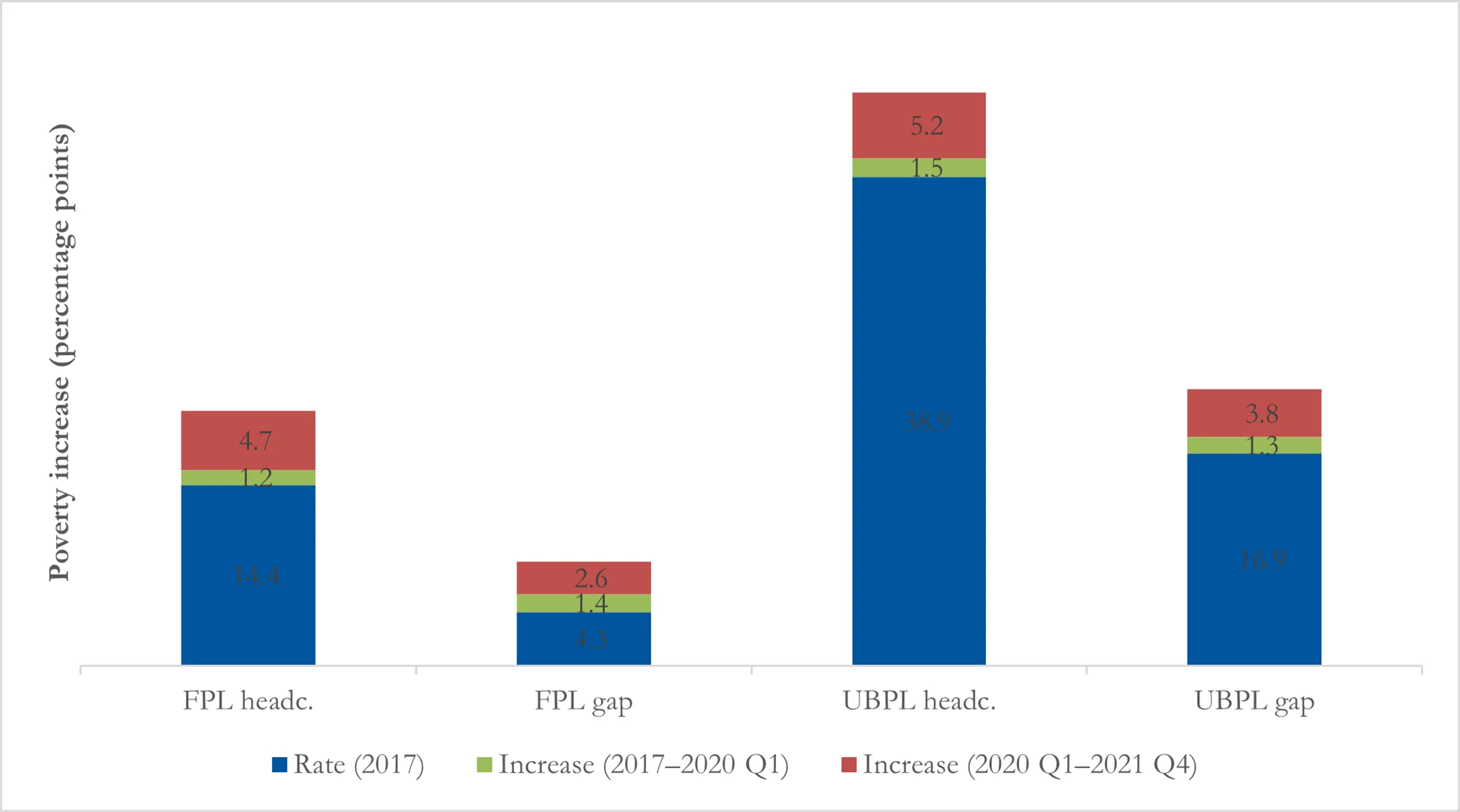
According to this set of results, poverty was also increasing in the pre-pandemic period, much more slowly, with a 1.5 percentage point increase in the UBPL headcount ratio over the 2017–2020 period (4 per cent) and a 1.2 percentage point increase in the FPL headcount ratio (8 per cent). The UBPL and FPL poverty gap increased by 1.3 percentage points (8 per cent) and 1.4 percentage points (33 per cent but off a low base) respectively. However, these pre-pandemic estimates need to be interpreted cautiously. As discussed in Section 3.3, we expect our updating method to work less well outside of periods with large employment shocks such as the pandemic, and indeed Section 6 shows that these particular results are highly sensitive to the updating method used.
5.2. Special COVID-19 SRD grant
The Special COVID-19 SRD grant is a ZAR350 per month (56 per cent of the FPL) digitally-administered conditional grant. Despite initially being conceived of as a temporary measure when introduced in May 2020, it was extended multiple times until April 2021, at which point it was suspended and then reinstated in August 2021, with all applicants required to reapply (Gronbach et al., 2022). As of the time of writing, it is still in operation.
Eligible applicants are meant to be older than 18, unemployed, and not receiving income from a variety of other government programmes (see Appendix E for additional details of the policy design, implementation, and our criteria for programme eligibility in the simulation). In reality, the employment test became a test of formal employment using government administrative data, with a means test of ZAR585 per month (the 2020 FPL) applied only to individuals who appealed their grant denial (Goldman et al., 2021).
We model the grant by means of a simulation, given that we do not observe Special COVID-19 SRD recipients in the QLFS. While some 21.5 million individuals are apparently eligible for the grant in the QLFS, 10.5 million were approved for payment in Statistics South Africa (2022a) only 9.7 million received a pay-out (SASSA, 2022). We select 10 million recipients from the pool of eligible individuals according to the proportional distribution observed in the National Income Dynamics Study—Coronavirus Rapid Mobile Survey (NIDS-CRAM) (Bassier et al., 2021; Bassier et al., 2021). Note that while we take into account actual disbursement in the simulation, the distribution of the grant may differ from actual distributional allocation of the grant, particularly given issues with the NIDS-CRAM data of reliability, granularity, and representativity, the fact that individuals had to reapply for the latest phase of the grant, and the timing of the NIDS-CRAM data collection (Wave 3, October 2020) compared with our Q4 2021 estimates.
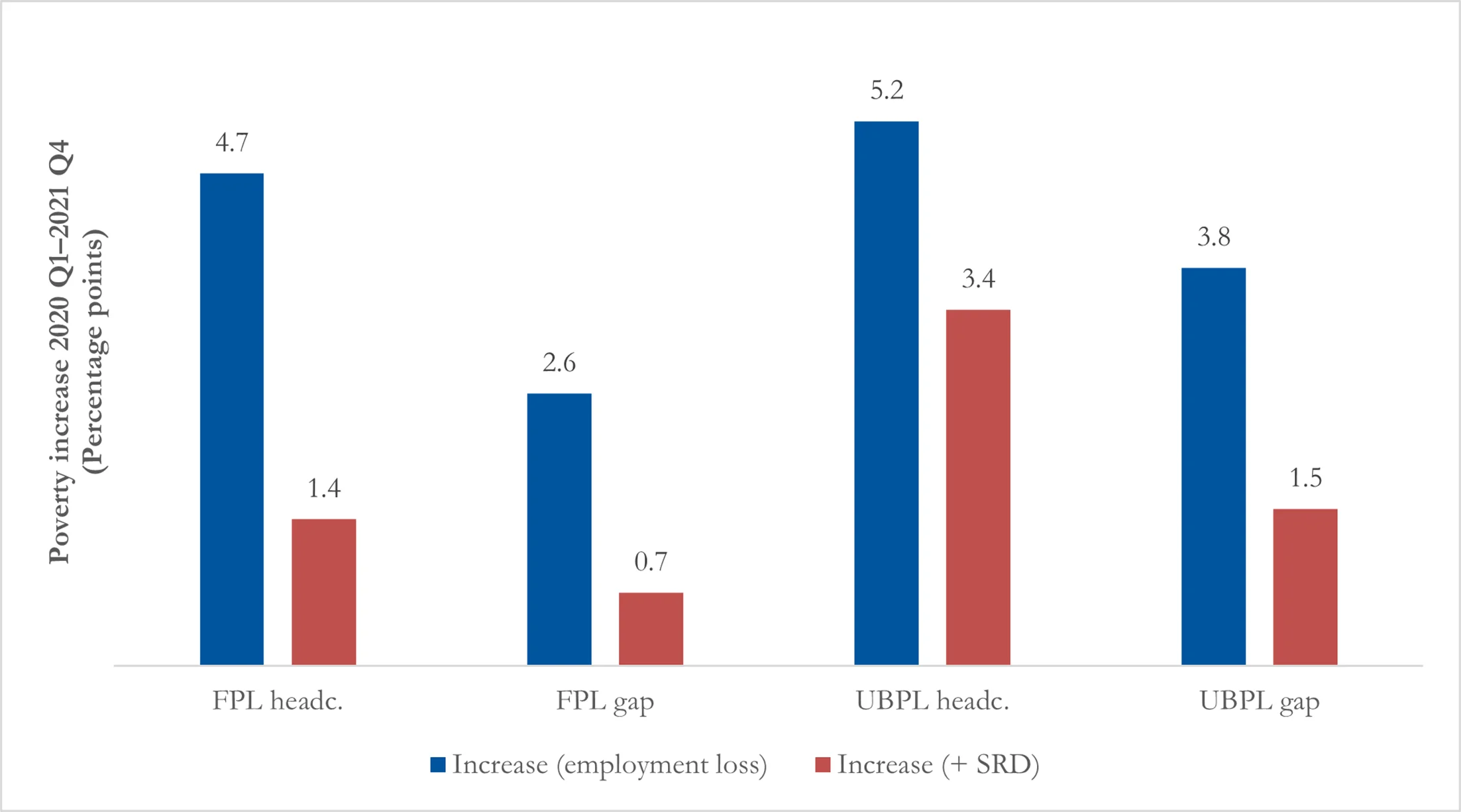
Our simulations suggest the grant was effectively able to mitigate 35 per cent of the poverty headcount increase at the UBPL (61 per cent of the poverty gap) and 70 per cent of the poverty headcount increase at the FPL (73 per cent of the poverty gap) (Figure 2). While the size of the grant is small at R350 per month—only 26 per cent of the 2021 UBPL—it was received by close to 10 million people in December 2021. In comparison, our highest estimate shows an increase of 3.1 million additional poor individuals at the UBPL during the pandemic due to job loss. Of course, not all of these individuals will be lifted out of poverty due to the SRD – it depends on the size of the gap.
6. Range of poverty estimates
6.1. LCS vs NIDS changes
As noted above, our main results are presented using just the NIDS dataset, updated to match percentage changes in employment in the QLFS. In this section we present and compare results when using different updating methods or datasets.
Table 1 presents a summary of the pandemic-period poverty changes using the different methods. We show both the FPL and the UBPL results, but report only on the UBPL results in the text for simplicity. Appendix F provides additional figures and discussion of both the LCS vs NIDS results (Figure F1) and the NIDS levels vs NIDS changes results (Figure F2), as well as discussion of poverty changes leading up to the pandemic.
Updating for employment loss using the NIDS dataset and matching changes in the QLFS employment rates produces the highest estimated increases in poverty. Table 1 shows our baseline method estimates that from 2020 Q1 to 2021 Q4 there was a 5.2 percentage point increase in the poverty headcount (3.1 million individuals or an 11.4 per cent increase), and a 3.8 percentage point increase in the poverty gap (a 17.3 per cent increase). This decreases to 3.4 percentage points (2.0 million individuals and 8.4 per cent) in the poverty headcount and 1.5 percentage points (8.2 per cent) in the poverty gap once we take the simulated Special COVID-19 SRD into account.
When we vary the method, matching QLFS employment levels in 2017 and 2021, we find that the estimates are substantially lower, at 3.0 percentage points for the poverty headcount (1.8 million individuals, 6.4 per cent increase), and 2.5 for the poverty gap (10.5 per cent increase). This decreases to 1.1 percentage points (0.7 million and 2.5 per cent) in the poverty headcount and 0.2 percentage points (0.9 per cent) in the poverty gap once we take the simulation of the Special COVID-19 SRD into account.
Applying the changes method to the LCS dataset produces estimates in-between the NIDS changes and NIDS levels method. There is a 4.0 percentage point increase in the poverty headcount (2.4 million individuals, 8.2 per cent increase), and a 3.0 change in the poverty gap (11.9 per cent increase).17
In summary, whether we look at the results with or without the simulated Special COVID-19 SRD, there is a substantial level of uncertainty in these poverty estimates, with a grey area of about 1.3–1.4 million individuals who may or may not have been impoverished by the pandemic. The upper-bound poverty headcount increases by between 7 and 13 per cent and the poverty gap between 12 and 21 per cent taking only employment loss into account. Once we take into account the simulated Special COVID-19 SRD, we find that the upper-bound poverty headcount increases by between 2.5 and 8.4 per cent, the poverty gap between 0.9 and 8.2 per cent.
6.2. Comparison with existing estimates in the literature
We further compare our poverty results with two other estimates of mid-COVID-19 poverty in the literature (Table 2). Barnes et al. (2021) estimate job-loss-induced poverty for April 2020, and Van de Heever et al. (2021) present an estimate of employment-change-related poverty in Q4 of 2020 (we compare with their estimates without the Special COVID-19 SRD policy included). We consider these estimates to be broadly comparable: these papers use related but different methods, and in both cases their methodologies also differ from our own in important ways. Appendix G presents a detailed discussion of their methods and potential strengths and weaknesses. A general issue which must be kept in mind is that substantial COVID-19 related social assistance apart from the Special COVID-19 SRD was implemented in 2020, which we do not include in our 2020 Q2 and 2020 Q4 poverty estimates. This will have a limited effect on our comparisons, however, as we compare to the Barnes et al. (2021) April estimate, which is before these policies came into effect, and the Van de Heever et al. (2021) 2020 Q4 estimate, when these policies ended in October 2020.
| Poverty headcount ratio estimates (%) | ||||||||
|---|---|---|---|---|---|---|---|---|
| Poverty line | Barnes et al. | Van den Heever et al. | NIDS levels | |||||
| Mar 2020 | April 2020 | 2020 Q4 | 2020 Q1 | 2020 Q2 | 2020 Q4 | 2021 Q4 | ||
| FPL | 20.6 | 26.3 | 21.2 | 19.6 | 22.5 | 21.6 | 22.9 | |
| UBPL | 48.2 | 52.5 | 48.9 | 44.0 | 46.7 | 46.0 | 47.0 | |
Note: authors’ estimates calculated here using most comparable method (NIDS levels); authors’ estimates and 2020 Q2 broadly comparable estimates not including simulated allocations of the Special COVID-19 SRD; broadly comparable poverty rate estimates modelled using income aggregate; authors’ estimates based on 2021 poverty lines; broadly comparable estimates based on 2019 lines adjusted using CPI to 2021; differences likely to be minimal.
Source: author’s estimates based on QLFS 2017, 2020 Q4, 2021 Q4; NIDS 2017; broadly comparable estimates for April 2020 based on Barnes et al. (2021) (including simulated TERS receipt) and for 2020 Q4 on Van de Heever et al. (2021).
The Barnes et al. (2021) estimates are for April 2020 (they update NIDS 2017 using NIDS-CRAM) and therefore are not directly comparable to any estimates we can produce using the quarterly data of the QLFS. Our closest comparison is updating NIDS 2017 (by matching on levels) to QLFS 2020 Q2, but Jain et al. (2020a) show that there was non-negligible employment recovery and poverty reduction over the second quarter of 2020, from April to June. We would therefore expect the Barnes et al. (2021) April estimates to show higher poverty than our 2020 Q2 equivalent, because our quarterly data incorporates some April–June recovery.
Indeed, this is exactly what we see: for 2020 Q2 our estimated headcount ratios are 22.5 and 46.7 per cent at the FPL and UBPL respectively, while the equivalent April 2020 estimates from Barnes et al. (2021) are 26.3 and 52.5 per cent. However, we are wary of attributing all of the substantial difference in our results to different time periods; as discussed in Appendix G, we believe that poverty may be overestimated in Barnes et al. (2021). It is notable that the Barnes et al. (2021) poverty estimates do reduce sharply after April 2020, as they simulate the various COVID-19 relief policies and automatic stabilizers; so much so that poverty in June 2020 is actually lower than in the pre-pandemic period.
Van de Heever et al. (2021) present poverty results for 2020 Q4 by updating NIDS to match the QLFS. While their method is substantively different from ours, in this case a direct comparison of the results to our own is possible (for this comparison we update NIDS to 2020 Q4 by matching on levels). Our headline poverty results are fairly similar. While we estimate UBPL and FPL headcount ratios of 21.6 and 46.0 per cent respectively in 2020 Q4, Van de Heever et al. (2021) estimate headcount ratios of 21.2 and 48.9 per cent.
Conducting this analysis provides us with a set of estimates over time. Our method suggests that in the absence of the Special COVID-19 SRD grant, there was no employment-induced poverty reduction over the period of the pandemic, with employment-related poverty essentially remaining constant. This is consistent with the QLFS data, which report no substantive employment recovery over the period of 2020 Q2 to 2021 Q4. This is a particularly stark finding, which must be considered alongside the active debate about whether the QLFS might understate employment recovery in the pandemic period (see Section 4.2).
7. Conclusion
The contribution of this paper is to estimate the impact on poverty rates of the COVID-19 employment loss and subsequent allocation of the Special COVID-19 SRD grant, between the first quarter of 2020 and the fourth quarter of 2021. This is challenging in the absence of up-to-date income and expenditure household surveys, and we generate synthetic datasets for NIDS 2017 and LCS 2014/15 surveys updated to the fourth quarter of 2021, using the QLFS. This allows us to take into account the distribution of incomes in the household survey and to account for heterogeneity in employment changes across demographic groups.
We generate the synthetic 2021 household datasets in three steps: we forecast incomes using per capita GNI from the national accounts, we reweight the dataset to take demographic changes into account, and we simulate employment losses and gains. This procedure matches employment rates or employment rate changes for a set of demographic characteristics and employment sectors.
Our disposable income aggregate is based on income rather than consumption, and as a result not the same as is used for official poverty statistics. Rather than focusing on poverty levels, then, the key result is the change in the size of the poverty rates in each method, and the impact of the simulated Special COVID-19 SRD in attenuating the poverty increase.
A set of diagnostic checks suggests that the method works fairly well for poverty, but we suspect not as well for inequality. The method tends to smooth out divergences from the mean in the data—for example, white employment is revised downwards, while female employment is revised upwards.
To account for differences in official sources of data, we run our estimates using three different updating methods. The first method matches the employment change in the NIDS data to the employment change in the QLFS data, while the second matches the employment levels in the NIDS data to the employment levels in the QLFS data. The third matches the LCS employment change to the QLFS employment change.
The variation based on methods is fairly large. A main reason for uncertainty in these numbers is the disagreement in employment rates across the three survey datasets, with the LCS and NIDS producing higher employment rates than the QLFS.
We find the increase in poverty due to employment change to be substantial. Compared with existing estimates for March 2020 and April 2020 (Barnes et al., 2021) and 2020 Q4 ( Van de Heever et al., 2021) our estimates suggest a lower increase in poverty in the initial period of the pandemic than Barnes et al. (2021) but we have a headcount ratio for 2020 Q4 similar to that of Van de Heever et al. (2021).
Encouragingly, when we simulate provision of the Special COVID-19 SRD grant to 10 million recipients, our estimates of the poverty increase are considerably lower.
Using the NIDS dataset and matching on employment levels in the QLFS, we produce estimates for Q2 and Q4 of 2020, and Q4 of 2021. These show job-loss-induced poverty to be roughly constant over the less than two-year portion of the pandemic captured here if one excludes the effect of the Special COVID-19 SRD. This is consistent with the lack of labour market recovery over this period in the QLFS data.
Footnotes
1.
This was the National Income Dynamics Study—Coronavirus Rapid Mobile Survey (NIDS-CRAM). It used an income measure that was not comparable with that of previous surveys and was discontinued due to quality concerns. See Jain et al. (2020b) for discussion of the income measure and an attendant attempt to measure some poverty impacts in the first wave of the survey.
2.
Disposable income in a tax and benefit microsimulation model refers to an income aggregate that includes private income, net of direct taxes on income and salaries and direct transfers. Note that our aggregate differs from the official poverty aggregate in that it is based on income rather than consumption. This is discussed in more detail in Section 3.1 and in Appendix A.2.
3.
Note that we also run the method giving primacy to the QLFS data on the LCS 2014/15 dataset, and we find that the results are very similar to those of the LCS method. For simplicity we do not discuss the method or results here.
4.
See the appendix of the working paper version of this article for a full variable list used in the updating procedure.
5.
We do not simulate the impacts of other relief programmes such as the Presidential Employment Stimulus, the Unemployment Insurance Fund COVID19 Temporary Employment Relief (UIF COVID19 TERS), or various ‘top-ups’ to existing grants which were implemented during 2020. While this means that our poverty estimates will be somewhat overestimated during periods when these policies were in effect, the UIF COVID19 TERS and grant top-ups had been discontinued by the period of our main results, 2021 Q4.
6.
See Appendix A.2 for more detail on how income is captured in the NIDS and LCS.
7.
We use nominal values in order to produce a dataset that in 2021 will be comparable with 2021 poverty lines and administrative values for grants and income tax brackets, for example. The studies mentioned here use GDP while we use GNI; however, the differences are negligible. We also considered using private disposable income as an alternative, and again find the differences in growth rates to be small enough to ignore.
8.
We have 145 dimensions (136 + 9) because we separately impose that weighted age-race-gender population proportions match the national age-race-gender proportions per the MYPE (136 constraints) and that weighted provincial total population proportions match the provincial total population proportions per the MYPE (9 constraints). We do not directly impose that weighted age-race-gender proportions for each province match the equivalent provincial age-race-gender proportions in the MYPE; this would require demographic and provincial interactions, leading to 1224 constraints (136 × 9). We do require that recalibrated weights be constant within households, as in the underlying surveys, and do not allow missing item response in any of these demographic variables, as we need to use these same categories for the employment-updating process discussed below. If any individual is missing one of these characteristics, we impute it at random (with probabilities in proportion with the distribution of non-missing responses). This affects very few observations in practice.
9.
Questions have been raised about the accuracy of the pandemic-period QLFS (Paton, 2022; Simkins, 2021) and some analysts prefer the alternative NIDS-CRAM dataset,. In our view there are few technical reasons to prefer one dataset over the other; our use of the QLFS is necessitated by our requiring a consistent labour market series pre- and post-pandemic, which is available from no other source. The QLFS also has the advantage of being the official source of labour statistics in South Africa. We discuss potential issues with the QLFS and its divergences from NIDS-CRAM in Section 4.2, under ‘Household disposable income’.
10.
When updating NIDS we use 2017 as the base year, and when updating LCS we use 2015.
11.
In order to reduce dimensionality, we define race as a binary variable for the purposes of our matching algorithm, collapsing the standard African, coloured, and Indian/Asian classifications in South Africa into one category, with white as the other category. In our diagnostic section we nonetheless present results for each of the standard four racial typologies.
12.
These categories are selected from a review of the NIDS-CRAM literature, in particular Casale and Posel (2021); Jain et al. (2020b); and Ranchhod and Daniels (2021).
13.
Industry classification is not available in the LCS, so we use only formal/informal and a non-employed category when it comes to employment sectors, leading to three employment groups. The formal/informal definition in the LCS is also different to the NIDS definition. For each matching process we create an analogous formal/informal variable in the QLFS.
14.
Note that an alternative implementation to the cell-by-cell matching would be a regression approach. Specifically, one could create a cell-level dataset with the changes in the probability of employment (positive for employment growth, negative for employment loss), and regress this on cell characteristics such as gender, age, urban and education. A fully interacted version of this would be equivalent to the cell-by-cell approach that we implement. The advantage of such a regression approach would be that one could include fewer interactions, which would increase precision especially since there is an issue of a small number of observations in many cells. On the other hand, the disadvantage relative to the fully interacted approach would be that any non-interacted covariates rely on extrapolation which may be outside the common support of the actual employment probabilities of these groups, and also rely on a particular (variance-based) weighting of the covariate effect which may be less desirable than a proportions-based weighting in a prediction context. Ultimately we opted for the fully interacted approach, but any future work comparing the approaches would be useful.
15.
We update the NIDS 2017 data to 2020 Q1 very similarly to how we update it to 2021 Q4, outlined in Section 3, but instead use the 2020 Q1 QLFS to match employment changes rather than the 2021 Q4 QLFS. There are however differences when it comes to the income forecasting and demographic adjustments. For the nominal income adjustment, when adjusting for income growth after December 2019, we use the same CPI inflation factor (ie 8.85%) calculated from January 2020 to Statistics South Africa (2022a) For the demographic adjustment, we still reweight the NIDS data using the 2021 MYPE. These are convenient choices because we can use the same nominal poverty lines and population totals to compare 2020 Q1 and 2021 Q4 poverty estimates, but more than that they help us isolate the employment-induced poverty effects which this paper is concerned with, by abstracting from effects of nominal income or demographic changes. It is worth explicitly noting, however, that our results do not incorporate poverty effects due to these factors.
16.
The poverty lines are published by Statistics South Africa. The 2021 FPL was 624 rands (ZAR) per month while the UBPL was ZAR1,335 per month.
17.
Note that unlike the NIDS dataset, whether we apply the changes or levels method to the LCS dataset produces fairly similar results, with a 4.0 percentage point increase in the poverty headcount for both methods (2.4 million individuals, or an 8.2 and 7.7 per cent increase respectively), and a 3.0–3.1 change in the poverty gap (11.9 and 11.2 per cent increase respectively).
18.
That is, countries using an income aggregate, with a median income above US$172 in 2011 purchasing power parity (PPP), with a Gini index higher than 32.246, and which are not in the Europe and Central Asia region.
19.
Note that one possible extension to this income inflation method would be to estimate an index of distributional changes in household income growth per decile or quintile based on previous survey datasets or secondary surveys, and apply these to the GNI growth factor used to inflate income (see, for example, Van der Berg et al., 2007, who use a similar technique for adjusting surveys to be consistent with the national accounts). For this paper, in the spirit of keeping our method simple enough to be able to isolate the changes due to datasets versus method versus additional assumptions, we do not apply this technique here.
20.
Rather than using Wittenberg (2010)'s minimum cross-entropy estimation, they calibrate weights using iterative proportional fitting (raking). We do not expect these methods to lead to substantively different results.
21.
It is worth noting that their employment status variable is much more detailed than our own, with particular detail on different kinds of non-employment which we coarsely group together.
22.
These types of employment and earnings states are again substantially more detailed than our own, for example including a category for furloughed workers.
23.
From 2017 to 2021 (or 2015 to 2021) the Old Age Grant value increased by 18 per cent (or 34 per cent), the Child Support Grant value increased by 21 per cent (or 39 per cent), while the headline CPI increased by 16.5 per cent (or 32.5 per cent).
Appendix A.
A.1. Additional data details
A.1.1. Quarterly Labour Force Surveys sample size
The number of individuals and households in each dataset is detailed in Table A1. Importantly the QLFS data collection during the COVID-19 era was done telephonically, which resulted in the exclusion of households without telephones. The data was then adjusted for the resultant bias (Statistics South Africa 2022b).
| QLFS dataset | Individuals | Households |
|---|---|---|
| 2015 Q1 | 72,561 | 20,828 |
| 2017 Q1 | 69,353 | 20,529 |
| 2020 Q1 | 66,657 | 19,913 |
| 2020 Q2 | 47,103 | 13,408 |
| 2020 Q4 | 48,990 | 14,242 |
| 2021 Q4 | 39,073 | 11,502 |
Source: authors’ calculations based on QLFS 2015 Q1, 2017 Q1, 2020 Q1, 2021 Q4.
A.2. Income definitions
Income sources in the NIDS Wave 5 survey include labour market income (main and second job, casual wages, self-employment income, piece-rate income, bonus payments); government grant and other income (state old-age pension, disability grant, child support grant, foster care grant and care dependency grant, Unemployment Insurance Fund and workmen’s compensation); investment income from interest and dividends, rent, and private pensions and annuities; remittances; income from subsistence agriculture; and the value of own production consumed (Brophy et al., 2018). Income sources in the LCS 2014/15 dataset include salaries and wages; income from business activities and subsistence farming; rental income; royalties; interest and dividends on shares and income from share trading; receipts from pension, social welfare grants, and other annuity funds; and alimony, maintenance, and other allowances (Statistics South Africa, 2017a; Statistics South Africa, 2017b; Statistics South Africa (2017c)).
Appendix B.
B.1. Income forecasting: additional details
B.1.1. Income inflation growth rate
In this appendix we show how we estimated the income inflation growth rate for both the LCS and the NIDS surveys.
We inflate income from 2015 (LCS) and 2017 (NIDS) to 2021 using a combination of growth in per capita nominal GNI and CPI. We do this by calculating the growth from the survey year to June 2018/19 (LCS) or December 2019 (NIDS), and then using CPI growth to calculate the counterfactual GNI for 2021, in the absence of the COVID-19 pandemic.
B.1.1.1. Living Conditions Survey Statistics South Africa (2017a)
The LCS (Statistics South Africa, 2017a) was conducted from October 2014 to October 2015. We use an annual per capita GNI weighted by 0.25 for the previous year and 0.75 for the following year.
From 2014/15 to 2018/19, we see a per capita GNI growth rate of 1.21 (ZAR92,309 million/ZAR77,062 million). If we extend this growth by the 8.85 per cent growth in CPI from January 2020 to December 2021, we estimate a total counterfactual growth in per capita GNI, in the absence of the COVID-19 pandemic, from the survey year to 2020/21 of 1.32 (1.21*(1 + 0.085)) (see Table B1).
| Year | Per capita GNI | Year-on-year growth |
|---|---|---|
| 2014/15 | 77,062 | |
| 2015/16 | 81,474 | 1.06 |
| 2016/17 | 85,626 | 1.05 |
| 2017/18 | 89,172 | 1.04 |
| 2018/19 | 92,309 | 1.04 |
| 2019/20 | 91,681 | 0.99 |
| 2020/21 | 96,229 | 1.05 |
Source: authors’ estimates based on SARB (2022).
B.1.1.2. National Income Dynamics Study SALDRU (2018)
The NIDS was conducted from January 2017 to December 2017. From 2017 to 2019, we see a per capita GNI growth rate of 1.07 (ZAR93,072 million/86,633 million).
If we extend this by the 8.85 per cent growth in CPI from January 2020 to December 2021, we estimate a total counterfactual growth in per capita GNI, in the absence of the COVID-19 pandemic, from the survey year to 2020/21 of 1.17 (1.07*(1 + 0.085)) (see Table B2).
| Year | Per capita GNI | Year-on-year growth |
|---|---|---|
| 2017 | 86,633 | |
| 2018 | 90,018 | 1.04 |
| 2019 | 93,072 | 1.03 |
| 2020 | 91,217 | 0.98 |
Source: authors’ estimates based on SARB (2022).
B.2. Pass-through factor
Ravallion (2001) identifies four reasons for the divergence between growth in the national accounts and growth in household welfare in surveys, namely: (i) problems in measuring illegal, informal, household-based, and subsistence outputs in the national accounts; (ii) difficulties in separating out certain elements in the national accounts that do not belong under household income, such as spending in the not-for-profit sector; (iii) underestimation of top incomes in household surveys; and (iv) the use of different deflators.
Studies such as Lustig and Pabon (2020) and Younger et al. (2020) adjust for this by applying a 0.85 ‘pass-through’ rate, estimated by Negre et al. (2020) to be the global average. However, in the same study the authors also implement two different machine learning methods to determine the relevant variables that affect this pass-through rate—in theory allowing for a refined pass-through parameter.
Negre et al. (2020) detect a substantial difference in the pass-through rate for surveys using an income aggregate (1.01) as opposed to surveys using a consumption aggregate (0.72). However, while one method generates a pass-through factor of 0.86 for countries in South Africa’s subgroup, the other generates a pass-through factor of 1.39.18 Given the large range in these estimates, the variable nature of the ratio of survey to national accounts income even within the same survey series over time (Van der Berg et al., 2007), the fact that we are working with an income aggregate, and the authors’ acknowledgement that ‘a shortcoming of this method is that its coarseness means that small changes in underlying data could change the predictions’, we prefer to work with a pass-through factor of 1—equivalent to the average pass-through rate for surveys using income welfare aggregates.19
Appendix C
C.1. Employment updating: diagnostics tables
| Employment | ||||||
|---|---|---|---|---|---|---|
| Demographic characteristics | 2017 rates | 2021 rates | 2017–21 (% change) | |||
| QLFS | NIDS | QLFS | NIDS | QLFS | NIDS | |
| All | 58.0 | 63.2 | 48.5 | 51.0 | −16.4 | −19.3 |
| Race | ||||||
| African | 54.9 | 61.8 | 45.5 | 49.0 | −17.1 | −20.7 |
| Coloured | 62.7 | 63.6 | 52.2 | 51.9 | −16.7 | −18.4 |
| Indian/Asian | 68.0 | 66.5 | 51.6 | 58.0 | −24.1 | −12.8 |
| White | 79.6 | 79.0 | 78.9 | 70.4 | −0.9 | −10.9 |
| Gender | ||||||
| Female | 65.0 | 72.9 | 55.1 | 58.1 | −15.2 | −20.3 |
| Male | 51.1 | 53.8 | 41.9 | 44.0 | −18.0 | −18.2 |
| Rural/urban | ||||||
| Rural | 44.9 | 52.3 | 37.2 | 42.9 | −17.1 | −18.0 |
| Urban | 63.1 | 68.1 | 53.4 | 54.6 | −15.4 | −19.8 |
| Education | ||||||
| Less than matric | 48.8 | 54.1 | 40.4 | 42.3 | −17.2 | −21.8 |
| Matric | 62.9 | 64.1 | 50.4 | 49.7 | −19.9 | −22.5 |
| Tertiary | 81.9 | 82.0 | 73.9 | 71.2 | −9.8 | −13.2 |
Note: supercolumn (a) shows the employment rates in the original 2017 data, for NIDS and QLFS, supercolumn (b) the employment rates for 2021 Q4 in the updated dataset, and supercolumn (c) the % change in the QLFS and NIDS from 2017 to 2021 Q4; we disaggregate into the usual four racial groups rather than the aggregated two we use for the updating algorithm; restricted to ages 25–55.
Source: authors’ estimates based on QLFS 2017, 2021 Q4; NIDS 2017.
| Employment sector | Employment | |||||
|---|---|---|---|---|---|---|
| 2017 rates (%) | 2021 rates (%) | 2017–21 (% change) | ||||
| QLFS | NIDS | QLFS | NIDS | QLFS | NIDS | |
| Formal/informal | ||||||
| Informal | 28.3 | 32.5 | 28.0 | 31.9 | −1.1 | −1.8 |
| Sector | ||||||
| Agriculture | 8.1 | 10.9 | 8.4 | 11.9 | 3.7 | 9.2 |
| Util./fin. | 21.8 | 18.3 | 24.2 | 20.3 | 11.0 | 10.9 |
| Industry | 20.3 | 19.0 | 17.0 | 15.4 | −16.3 | −18.9 |
| Trade | 19.4 | 16.3 | 19.7 | 15.9 | 1.5 | −2.5 |
| Services | 22.2 | 25.3 | 22.2 | 25.6 | - | 1.2 |
| Private households | 8.2 | 10.2 | 8.6 | 11.0 | 4.9 | 7.8 |
Note: supercolumn (a) shows the proportions of employed in the original 2017 data, for NIDS and QLFS, supercolumn (b) the proportions of employed for 2021 Q4 in the updated dataset; and supercolumn (c) the % change in the QLFS and NIDS from 2017 to 2021 Q4; data restricted to ages 25–55.
Source: authors’ estimates based on QLFS 2017, 2021 Q4; NIDS 2017.
| Employment | ||||||
|---|---|---|---|---|---|---|
| Province | 2017 rates | 2021 rates | 2017–21 (% change) | |||
| QLFS | NIDS | QLFS | NIDS | QLFS | NIDS | |
| Eastern Cape | 49.5 | 55.6 | 40.5 | 46.1 | −18.2 | −17.1 |
| Free State | 52.9 | 62.1 | 50.1 | 48.9 | −5.3 | −21.3 |
| Gauteng | 64.6 | 69.5 | 53.1 | 55.9 | −17.8 | −19.6 |
| KwaZulu-Natal | 52.1 | 61.6 | 44.8 | 52.0 | −14.0 | −15.6 |
| Limpopo | 53.7 | 57.0 | 42.0 | 45.4 | −21.8 | −20.4 |
| Mpumalanga | 58.0 | 62.9 | 46.7 | 49.1 | −19.5 | −21.9 |
| Northern Cape | 50.6 | 62.2 | 45.1 | 50.4 | −10.9 | −19.0 |
| North West | 53.5 | 60.2 | 43.3 | 49.2 | −19.1 | −18.3 |
| Western Cape | 67.4 | 63.1 | 58.9 | 48.6 | −12.6 | −23.0 |
Notes: supercolumn (a) shows the employment rates in the original 2017 data, for NIDS and QLFS, supercolumn (b) the employment rates for 2021 Q4 in the updated dataset, and supercolumn (c) the % change in the QLFS and NIDS from 2017 to 2021 Q4; data restricted to ages 25–55.
Source: authors’ estimates based on QLFS 2017, 2021 Q4; NIDS 2017.
| Year | Per capita national income | ||
|---|---|---|---|
| GNI in national accounts | Disposable income | ||
| Matching on changes | Matching on levels | ||
| Growth | |||
| 2017 to 2019 | 1.07 | 1.02 | 1.03 |
| 2020 Q1 to 2021 Q4 | 1.09 | 0.94 | 0.97 |
| 2020 Q1 to 2021 Q4 + SRD | 0.94 | 0.99 | |
Source: authors’ calculations based on SARB (2022) and NIDS 2017.
Appendix D.
D.1. Diagnostic results for sensitivity tests
D.1.1. LCS vs NIDS changes
Table D1 shows employment rates by demographic groups when the 2015 LCS rather than the 2017 NIDS is the underlying dataset, but still matching on changes. As is the case with NIDS, the LCS has higher baseline employment rates than the contemporaneous QLFS. The matching process seems to work well for the demographic categories we match on, as the implied changes over time in the LCS match the QLFS better than is the case for NIDS. Contributing factors for this may be that the larger sample size of the LCS and the lack of industry information means matching with substantially fewer cells, thus leading to less noise from matching on small cell sizes and distortions caused by empty cells in the QLFS or base data. The trade-off of less industry information is that the updated LCS likely does not reflect changing industrial structure—types of jobs—as well as NIDS does.
| Demographic characteristics | 2015 rates (%) | 2021 rates (%) | 2017–21 (% change) | |||
|---|---|---|---|---|---|---|
| QLFS | LCS | QLFS | LCS | QLFS | LCS | |
| All | 57 | 61 | 49 | 53 | −15 | −14 |
| Race | ||||||
| African | 54 | 58 | 46 | 50 | −16 | −13 |
| Coloured | 63 | 68 | 52 | 55 | −17 | −19 |
| Indian/Asian | 65 | 70 | 52 | 61 | −20 | −14 |
| White | 78 | 83 | 79 | 77 | 1 | −7 |
| Gender | ||||||
| Female | 65 | 68 | 55 | 59 | −15 | −14 |
| Male | 50 | 55 | 42 | 47 | -16 | -14 |
| Rural/urban | ||||||
| Rural | 45 | 46 | 37 | 40 | -17 | -14 |
| Urban | 62 | 68 | 53 | 58 | -14 | -14 |
| Education | ||||||
| Less than matric | 49 | 52 | 40 | 45 | −17 | −14 |
| Matric | 62 | 67 | 50 | 56 | −19 | −15 |
| Tertiary | 81 | 87 | 74 | 78 | −9 | −10 |
Notes: supercolumn (a) shows the employment rates in the original 2015 data, for LCS and QLFS, supercolumn (b) the employment rates for 2021 Q4 in the updated dataset, and supercolumn (c) the % change in the QLFS and LCS from 2015 to 2021 Q4; we disaggregate into the usual four racial groups rather than the aggregated two we use for the updating algorithm; restricted to ages 25–55.
Source: authors' estimates based on QLFS 2015, 2021 Q4; LCS 2014/15.
D.1.2. NIDS levels vs changes
When matching on levels rather than changes, a different focus is needed when reading the diagnostics tables. It is no longer useful to substantively interpret changes from 2017 to 2021 Q4 as a ‘change over time’, as these changes are driven by a combination of a real evolution of employment between 2017 and 2021, which is substantively interesting, and the one-time adjusting of the NIDS data to ‘look like’ the QLFS in levels.
When looking at the employment rates by demographic group in Table D2 it is therefore informative to look not at how the QLFS and NIDS rates change ‘over time’ between 2017 and 2021, but rather at how employment rates match in 2021 Q4, which is the objective of the matching-on-levels approach. It is apparent that generally, the updating procedure works very well when it comes to creating a NIDS dataset which looks like the QLFS in 2021 Q4—at least for the variables we match on. Again, however, our process potentially understates the true racial stratification and inequality of the labour market, with whites imputed a much lower employment rate than is reflected in the underlying NIDS and QLFS data.
| Demographic characteristics | 2017 rates (%) | 2021 rates (%) | 2017–21 (% change) | |||
|---|---|---|---|---|---|---|
| QLFS | NIDS | QLFS | NIDS | QLFS | NIDS | |
| All | 58 | 63 | 49 | 47 | −16 | −26 |
| Race | ||||||
| African | 55 | 62 | 46 | 44 | −17 | −29 |
| Coloured | 63 | 64 | 52 | 48 | −17 | −24 |
| Indian/Asian | 68 | 67 | 52 | 63 | −24 | −5 |
| White | 80 | 79 | 79 | 68 | −1 | −14 |
| Gender | ||||||
| Female | 65 | 73 | 55 | 51 | −15 | −30 |
| Male | 51 | 54 | 42 | 42 | −18 | −22 |
| Rural/urban | ||||||
| Rural | 45 | 52 | 37 | 37 | −17 | −30 |
| Urban | 63 | 68 | 53 | 51 | −15 | −25 |
| Education | ||||||
| Less than matric | 49 | 54 | 40 | 37 | −17 | −31 |
| Matric | 63 | 64 | 50 | 46 | −20 | −28 |
| Tertiary | 82 | 82 | 74 | 68 | −10 | −18 |
Notes: supercolumn (a) shows the employment rates in the original 2017 data, for NIDS and QLFS, supercolumn (b) the employment rates for 2021 Q4 in the updated dataset, and supercolumn (c) the % change in the QLFS and NIDS from 2017 to 2021 Q4; we disaggregate into the usual four racial groups rather than the aggregated two we use for the updating algorithm; restricted to ages 25–55.
Source: authors' estimates based on QLFS 2017, 2021 Q4; NIDS 2017.
Appendix E.
E.1. SRD Policy details
The Special COVID-19 SRD grant was introduced by the Department of Social Development and is administered by the South African Social Security Agency (SASSA). Eligible applicants may not receive pensions, Unemployment Insurance Fund (UIF) payments, or financial support via the National Student Financial Aid Scheme. Initially the grant excluded individuals receiving caregiver grants (the foster care grant, child support grant, or care dependency grant), but this criteria was challenged and removed from August 2021 (Zulu, 2021). The size of the means test has been incorrectly reportedly by various sources. The figure of ZARR585 per month was provided directly to us in a meeting with SASSA representatives.
In our simulation, we select 10 million recipients from the pool of eligible individuals according to the NIDS-CRAM proportional distribution observed in (Bassier et al., 2021; Bassier et al., 2021) as follows: 12 per cent of recipients are drawn from each of the first seven deciles, 8 per cent are drawn from deciles 8 and 9, and 2 per cent are drawn from decile 10. We include recipients of caregiver grants (child support, foster care, and care dependency grants) as per the phase two eligibility criteria.
Appendix F
F.1. Range of poverty results
F.1.1. LCS vs NIDS changes
The LCS estimates are more difficult to interpret than the NIDS estimates. Updating over the pre-pandemic period (from 2015 to 2020 Q1), we find a decline in poverty before an increase over the period of the pandemic. This initial poverty decrease is shown by the negative bars in Figure F1.
In order to read the total 2021 Q4 poverty level, one needs to subtract the negative component from the total bar height, but one can read the bar sections directly to understand changes. For example, the LCS upper-bound poverty gap was 23 per cent in 2015 (the blue main section of the bar) which then drops to 22 per cent in 2020Q1 (the negative green bar section is one percentage points in size). Over the pandemic period the poverty gap increases to 25 per cent in 2021Q4—a three-percentage-point increase (the uppermost red section of the bar).
In general, the pandemic employment-induced poverty increases from the LCS changes method are still large, but they are smaller in both absolute and relative terms than is the case with the NIDS changes method. The poverty headcount ratio at the UBPL increases by 4.0 percentage points—compared with the 5.2 percentage points in the NIDS changes method. This is a 9 per cent increase relative to 2020 Q1.
The poverty gap ratio increases by 3.0 percentage points at the UBPL over the pandemic, lower than the 3.8 and 2.6 percentage points estimated using the NIDS changes method. This is a 13.5 per cent increase compared with 2020 Q1 levels.
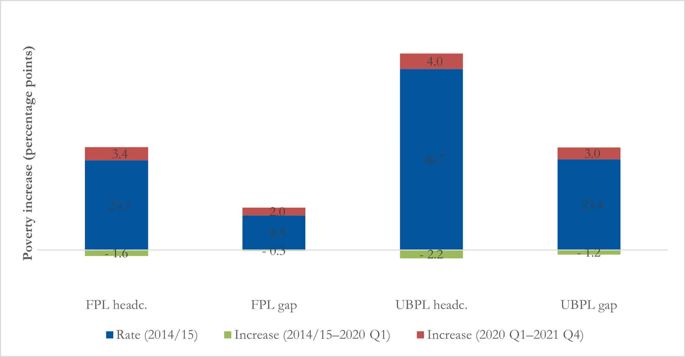
F.1.2. NIDS levels vs changes
When matching the NIDS 2017 data to QLFS employment levels rather than percentage employment changes over time, a different method is needed for making substantive conclusions about poverty over time (see Appendix D for employment diagnostic results). It is no longer useful to interpret the entirety of the changes from NIDS 2017 to 2021 as a substantive result, as these changes are driven by a combination of a real evolution of poverty between 2017 and 2021 and the methodological adjustment of employment levels in NIDS 2017 to ‘look like’ the QLFS.
Therefore, when looking at poverty changes from 2017, we first adjust the 2017 NIDS data to match the 2017 QLFS on levels (NIDS-QLFS 2017) and make comparisons with this baseline. As would be expected, this adjustment increases the baseline poverty rate because the QLFS implies a lower employment rate. This is evident from the higher poverty rates in Figure F1 than Figure F2. Once this adjustment has been made, we can compare poverty changes over time across methods, with the results for NIDS matched on levels in Figure F2. Matching on levels implies essentially no poverty change between 2017 and 2020, presenting a middle ground between the LCS results matched on changes which suggested poverty decreases over the pre-pandemic period, and NIDS results matched on changes which suggested poverty increases over the pre-pandemic period.
The size of the pandemic employment-induced poverty increase is lower than with both the NIDS and the LCS matched on employment changes. The increase in the headcount ratio at the UBPL is 3.0 percentage points (compared with 5.2 and 4.0 for NIDS and LCS matched on employment changes respectively). This is an increase of 7 per cent on 2020 Q1 levels.
The increase in the poverty gap is 2.5 percentage points (compared with 3.8 and 3.0 for NIDS and LCS matched on employment changes respectively). This is an increase of 12 per cent on 2020 Q1 levels.
Notes: the total height of each bar represents the 2021 Q4 poverty rate for the particular poverty measure and poverty line in the updated NIDS 2021 Q4 data, which is then disaggregated into the original 2017 poverty rate, the increase between 2017 and 2020 Q1, and the increase between 2020 Q1 and 2021 Q4; the 2021 FPL is ZAR624 per month and the UBPL is ZAR1,335 per month.
Source: authors’ estimates based on QLFS 2017, 2020 Q1, 2021Q4; NIDS 2017. Figure F2
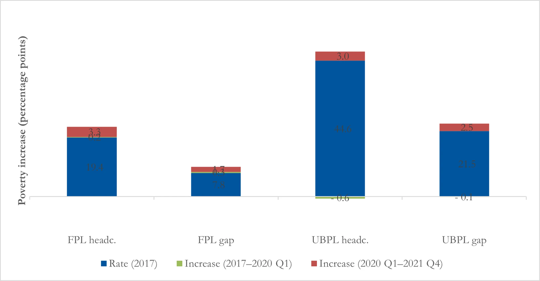
Appendix G.
G.1. Benchmarking against SAMOD datasets
As noted in the introduction, two papers perform a similar task to what we do in our analysis here: Barnes et al. (2021) and Van de Heever et al. (2021). The papers have authors in common and the SAMOD is an important component of both papers, but there are substantive differences in their overall methods. Below we discuss each paper in turn. SAMOD is a static micro-simulation model which imputes taxes and benefits based on the policies in South Africa and individual characteristics from an input dataset; it is described in Barnes et al. (2021).
G.1.1. Barnes et al. (2021)
Barnes et al. (2021) perform a very similar dataset updating procedure to us, and also benchmark the 2017 NIDS data to the QLFS. Their implementation does, however, have some important differences from our own. They start by reweighting NIDS to create a ‘pre-pandemic’ March 2020 dataset.20 However, in addition to reweighting to match the Statistics South Africa MYPE, as we do, they also reweight NIDS to match the QLFS 2020 Q1 employment profiles with regard to the detailed employment status variable interacted with occupation.21 This component of their procedure is conceptually comparable to our ‘matching on levels’, though reweighting is substantively different to direct changing of employment statuses, as we discuss in the subsection below.
Barnes et al. (2021) do change employment statuses directly in the second stage of their procedure, where they impose employment losses in the pre-pandemic data that match employment loss in the first wave of the NIDS-CRAM data, which is for April 2020. In a regression framework, they estimate the probabilities of different kinds of employment and earnings losses, with various demographic and employment predictors.22 They then assign individuals to different employment states based on these probabilities.
This aspect of their process is more comparable to our matching on changes, with an important difference: they only model job loss probabilities, and do not complement this with concurrent job gain probabilities. The South African labour market in general has a high rate of employment churn (Kerr, 2018), and this continued throughout the pandemic (Espi-Sanchis et al., 2022; Jain et al., 2020b). Jain et al. (2020b) show that 9 per cent of those who were not employed in February 2020 (pre-pandemic) were actively employed or on paid leave in April, with a further 2 per cent having some kind of other employment relationship and being ‘temporarily laid off’ in April. Only imposing employment losses is likely to lead to a potentially substantial overstatement of the net employment loss over the February–April period, and indeed Barnes et al. (2021) do note this as a likely part of the explanation for the much lower employment rate in their updated data (33 per cent) than in the NIDS-CRAM data (45 per cent). At the same time, it is notable that the extensive policy response they include in their simulation causes poverty to actually drop below pre-pandemic levels by June 2020.
G.1.2. Van de Heever et al. (2021)
Dataset updating is not a focus of Van de Heever et al. (2021), but it does form part of their analysis. They implement the reweighting method of Barnes et al. (2021) to adjust the 2017 NIDS data to match the employment profiles in the QLFS in 2020 Q4, rather than 2020 Q1. They then do not further adjust employment statuses or incomes (other than inflation adjustments). This is a substantive difference, as it means that unlike Barnes et al. (2021) and unlike our methodology here, they account for the pandemic employment shock by adjusting sample weights rather than directly changing individual employment statuses and incomes. In effect, to increase aggregate unemployment they increase the weights of those who were unemployed in the 2017 data and reduce the weights of those who were employed.
The potential drawback of this method, as opposed to direct employment status adjusting as in Barnes et al.’s (2021) and our own methods, is that it implicitly assumes that those newly unemployed over the period of the pandemic will be similar in characteristics to those unemployed in 2017, which is likely to be erroneous to some degree. Direct employment adjusting, in contrast, only affects employment status and incomes, leaving other characteristics of the sample unchanged.
The potential problem can be illustrated with an example. Receipt of social grants in 2017 is higher among the non-employed than the employed. Reweighting to increase unemployment will therefore also increase social grant receipt in the data, because the existing unemployed, who are up-weighted, disproportionately receive grants. However, in reality, those who became unemployed over the pandemic would be unlikely to increase their grant receipt—indeed, SASSA offices were frequently closed and the social grant application process takes time in any case. This means the reweighting may erroneously increase grant receipt in 2020, or other characteristics associated with non-employment.
These problems will be mitigated, perhaps substantially, by the simultaneous demographic reweighting of Van de Heever et al. (2021), which ensures that their 2020 demographic profile matches the Statistics South Africa MYPE (as is also the case in Barnes et al., 2021). But this is an empirical question, and the demographic reweighting is unlikely to fully resolve this issue.
It is worth noting that this reweighting approach may be superior to our method of directly updating employment statuses during ‘normal’ times, when we may expect increases in unemployment to be accompanied by changes such as increases in social grant receipt. However, it does seem problematic when attempting to adjust for a dramatic shock such as the COVID-19 pandemic. Indeed, this is probably why Barnes et al. (2021) use reweighting to adjust to 2020 Q1, and then direct adjusting of employment statuses for the pandemic period.
A related issue is what to do about the changing distribution of grant eligibility in the ‘normal’ times leading up to the pandemic. We do not adjust grant receipt from what is reported in NIDS 2017 (and LCS 2015), and to the extent that the distribution of grant receipt changed in the years preceding the pandemic this may cause some inaccuracies in our analysis. In contrast, Barnes et al. (2021) and Van de Heever et al. (2021) simulate grant receipt based on de jure eligibility, which may account for some changes in grant receipt over time but then risks introducing simulation errors. These decisions in turn raise the question of how grant values are adjusted over time. Because we do not separate grant income out from disposable income at large, we inflate grant values by the same factor as market incomes, as discussed in Section 3.1. This could create inaccuracies, but we do not expect it to be particularly consequential because grant increases over these periods were roughly in line with headline inflation.23
References
- Adams-Prassl, A, Boneva, T, Golin, M, Rauh, C (2020). Inequality in the impact of the coronavirus shock: Evidence from real time surveys. Journal of Public Economics, 189. https://doi.org/10.1016/j.jpubeco.2020.104245
- Barletta, G, Castigo, F, Egger, E, Keller, M, Salvucci, V, Tarp, F (2021). Helsinki: UNU-WIDER.
- Barnes, H, Espi-Sanchis, G, Leibbrandt, M, McLennan, D (2021). Analysis of the Distributional Effects of COVID-19 and State-led Remedial Measures in South Africa. International Journal of Microsimulation, 14, 2–31. https://doi.org/10.34196/IJM.00234
- Barrero, JM, Bloom, N, Davis, SJ (2020). Cambridge, MA: National Bureau of Economic Research (NBER).
- Barrero, JM, Bloom, N, Davis, SJ, Meyer, BH (2021). COVID-19 Is a Persistent Reallocation Shock. AEA Papers and Proceedings, 111, 287–291. https://doi.org/10.1257/pandp.20211110
- Basole, A, Abraham, R, Lahoti, R, Kesar, S, Jha, M, Nath, P, Kapoor, R, Mandela, SN, Shrivastava, A, Dasgupta, Z, Gupta, G, Narayanan, R (2021). State of Working India 2021: One Year of Covid-19’. Bangalore: Centre for Sustainable Development, Azim Premji University.
- Bassier, I, Budlender, J, Kerr, A (2021). Why the Employment Numbers Differ So Vastly in the Quarterly Labour Force Survey and NIDS-CRAM’. Daily Maverick, 25 February.
- Bassier, I, Budlender, J, Zizzamia, J (2021). The Labour Market Impacts of COVID-19 in South Africa: An Update with NIDS-CRAM Wave 3’. South Africa: Coronavirus Rapid Mobile Survey (CRAM).
- Bengoechea, GG (2020). New Orleans, LA: Commitment to Equity Institute, Tulane University.
- Bhalla, S, Bhasin, K, Virmani, A (2022). Washington DC: International Monetary Fund (IMF).
- Brophy, T, Branson, N, Daniels, RC, Leibbrandt, M, Mlatsheni, C, Woolard, I (2018). Cape Town: SALDRU.
- Brum, M, De Rosa, M (2021). Too little but not too late: nowcasting poverty and cash transfers’ incidence during COVID-19’s crisis. World Development, 140. https://doi.org/10.1016/j.worlddev.2020.105227
- Casale, D, Posel, D (2021). Gender inequality and the COVID-19 crisis: Evidence from a large national survey during South Africa’s lockdown. Research in Social Stratification and Mobility, 71, 1–5. https://doi.org/10.1016/j.rssm.2020.100569
- Cuesta, J, Pico, J (2020). The Gendered Poverty Effects of the COVID-19 Pandemic in Colombia. The European Journal of Development Research, 32, 1558–1591. https://doi.org/10.1057/s41287-020-00328-2
- Decerf, B, Ferreira, FHG, Mahler, DG, Sterck, O (2021). Lives and livelihoods: Estimates of the global mortality and poverty effects of the Covid-19 pandemic. World Development, 146. https://doi.org/10.1016/j.worlddev.2021.105561
- Diop, S, Asongu, SA (2023). The Covid-19 Pandemic and the New Poor in Africa: The Straw That Broke the Camel’s Back. Forum for Social Economics, 52, 143–154. https://doi.org/10.1080/07360932.2021.1884583
- Espi-Sanchis, G, Leibbrandt, M, Ranchhod, V (2022). Age, employment and labour force participation outcomes in COVID-era South Africa. Development Southern Africa, 39, 664–688. https://doi.org/10.1080/0376835X.2022.2051439
- Goldman, MIB, Budlender, J, Mzankomo, L, Woolard, I, Leibbrandt, M (2021). Helsinki: UNU-WIDER.
- Gronbach, L, Seekings, J, Megannon, V (2022). Social Protection in the COVID-19 Pandemic: Lessons from South Africa. CGD Policy Paper 252, February 2022. Washington, DC: Center for Global Development (CGD).
- Higa, M, Ospino, C, Aragon, F (2023). The persistent effects of COVID-19 on labour outcomes: evidence from Peru. Applied Economics Letters, 30, 1065–1076. https://doi.org/10.1080/13504851.2022.2036319
- Jain, R, Bassier, I, Budlender, J, Zizzamia, R (2020). University of Cape Town: SALDRU.
- Jain, R, Budlender, J, Zizzamia, R, Bassier, I (2020). University of Cape Town: SALDRU.
- Kerr, A (2018). Job Flows, Worker Flows and Churning in South Africa. South African Journal of Economics, 86, 141–166. https://doi.org/10.1111/saje.12168
- Lustig, N, Pabon, VM (2020). New Orleans, LA: Commitment to Equity Institute, Tulane University.
- Lustig, N, Pabon, VM, Sanz, F, Younger, SD (2021). New Orleans, LA: Commitment to Equity Institute, Tulane University.
- Mahler, DG, Lakner, C, Aguilar, RAC, Wu, H (2020). The Impact of COVID-19 (Coronavirus) on Global Poverty: Why Sub-Saharan Africa Might Be the Region Hardest Hit’. World Bank Data Blog, 20 April.
- Negre, M, Lakner, C, Prydz, EB, Mahler, DG (2020). Global Poverty Monitoring Technical Note 13. Washington, DC: World Bank.
- Paton, C (2022). SA’s Unemployment Stats Could Be Wrong, Say Experts’. Fin24, 9 May.
- Ranchhod, V, Daniels, RC (2021). Labour Market Dynamics in South Africa at the Onset of the COVID-19 Pandemic. The South African Journal of Economics. Suid-Afrikaanse Tydskrif Vir Ekonomie, 89, 44–62. https://doi.org/10.1111/saje.12283
- Ravallion, M (2001). Washington, DC: World Bank.
- (2018). National Income Dynamics Study 2017, Wave 5 [dataset]’. Version 1.0.0. Pretoria: Department of Planning, Monitoring, and Evaluation [funding agency].
- (2022). Online Statistical Query.
- (2022). Unpublished raw data. Tshwane: National Treasury.
- Simkins, C (2021). Johannesburg: Helen Susman Foundation.
- (2022). Consumer Price Index: December 2021’. Statistical Release P0141. Tshwane: Statistics South Africa.
- (2022). Quarterly Labour Force Survey (QLFS): Q4:2021’. Media Release 29 March. Tshwane: Statistics South Africa.
- (2021). National Poverty Lines 2021’. Statistical Release P0310.1: Tshwane: Statistics South Africa.
- (2021). Quarterly Labour Force Survey Quarter 1: 2021. Statistical Release P0211, 1 June.
- (2021). Quarterly Labour Force Survey 2021: Q1 [dataset].
- (2020). Mid-Year Population Estimates 2020. Statistical Release P0302.
- (2020). Quarterly Labour Force Survey 2020: Q4 [dataset].
- (2020). Quarterly Labour Force Survey 2020: Q2 [dataset].
- (2020). Quarterly Labour Force Survey 2020: Q1. Tshwane: Statistics South Africa [producer].
- (2017). Living Conditions Survey 2015: Metadata. Statistical Release P0310.
- (2017). Living Conditions Survey 2014–2015. Tshwane: Statistics South Africa [Producer].
- (2015). Quarterly Labour Force Survey 2015: Q1.
- (2017). Quarterly Labour Force Survey 2017: Q1. Tshwane: Statistics South Africa [producer].
- Sumner, A, Hoy, C, Ortiz-Juarez, E (2020). WIDER Working Paper 2020/43.
- Suryahadi, A, Al Izzati, R, Suryadarma, D (2020). Estimating the Impact of Covid-19 on Poverty in Indonesia. Bulletin of Indonesian Economic Studies, 56, 175–192. https://doi.org/10.1080/00074918.2020.1779390
- Van de Heever, A, Chitiga-Mabugu, M, Devereux, S, Leibbrandt, M, Sachs, M, Wright, G (2021). Tshwane: Department of Social Development, Republic of South Africa.
- Van der Berg, S, Burger, R, Burger, R, Louw, M, Yu, D (2007). Stellenbosch: Department of Economics, Stellenbosch University.
- Wheaton, L, Giannarelli, L, Dehry, I (2021). Washington, DC: Urban Institute.
- Wilkinson, K (2020). Comment: South Africa’s Poverty and Income Statistics Fall Victim to Covid-19.
- Wittenberg, M (2010). An Introduction to Maximum Entropy and Minimum Cross-entropy Estimation Using Stata. The Stata Journal, 10, 315–330. https://doi.org/10.1177/1536867X1001000301
- Younger, SD, Musisi, A, Asiimwe, W, Ntungire, N, Rauschendorfer, J, Manwaring, P (2020). London: International Growth Centre (IGC).
- Zulu, L (2021). Re-introduction of Special COVID-19 SRD grant’. Speaking notes. Tshwane: Department of Social Development. https://www.gov.za/news/speeches/minister-lindiwe-zulu-re-introduction-special-covid-19-srd-grant-04-aug-2021.
Article and author information
Author details
Acknowledgements
We gratefully acknowledge guidance and comments from Murray Leibbrandt and Ingrid Woolard, and feedback provided in an open seminar hosted by the Southern Africa Labour and Development Research Unit (SALDRU), University of Cape Town—in particular the comments of Reza C. Daniels, Taryn Dinkelman, Andrew Kerr, David McLennan, Monique Petersen, Vimal Ranchhod, and Werner Ruch. We extend special thanks to Gabriel Espi-Sanchis, Professor Michael Noble, and especially Professor Gemma Wright for their generosity in discussing their methodologies and sharing their datasets. We thank Luke Finley for copy editing an earlier version of this paper. Lastly, we thank two anonymous reviewers for thoughtful and helpful comments. Any remaining mistakes are our own.
Publication history
Copyright
© 2025, Bassier et al.
This article is distributed under the terms of the (Creative Commons Attribution License, which permits unrestricted use and redistribution provided that the original author and source are credited.